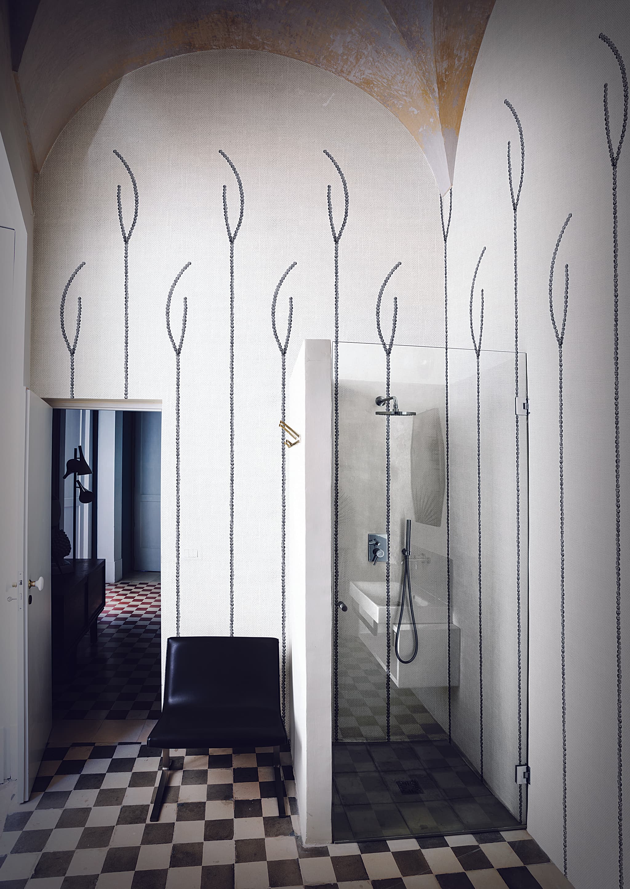
Striped Wallpaper: Stripe Types and How They Shape a Room
A stripe is a long, narrow band set apart from the surface around it by colour or by texture. This guide names the kinds of stripe in the trade’s own terms, explains what direction, width and contrast do to a wall, and shows how designers set stripes beside other patterns.
“A long narrow band distinguished, as by color or texture, from the surrounding material or surface.”
Striped wallpaper repeats a stripe across a wall: parallel bands or lines on a contrasting background, in the dictionary’s definition of the pattern. The contrast can come from colour, as in a candy stripe, or from tone and texture alone, as in LondonArt’s Florence.
The interiors magazine Livingetc names three of the hardest choices in a striped wall: which way the stripes run, how wide they are, and what they are made of. A fourth, contrast, decides how much attention the wall draws. The sections below take direction, contrast and width in turn, and the range that follows them shows each design in a room, with its maker and how it is made.
Striped wallpaper has been printed for more than two and a half centuries. The Victoria and Albert Museum holds a French paper of about 1760 printed with “a floral design in two tones of blue, on a stripe and pin-point background”, an English paper of the first half of the nineteenth century “with stripes of varying widths in varying shades of brown”, and a striped border hung at the Royal Pavilion, Brighton, about 1829. That border falls within the English Regency style, which the Getty’s Art & Architecture Thesaurus dates from the regency of George, Prince of Wales, in 1811 to the end of his reign as George IV in 1830.
From pinstripe to strié
Most stripe names are textile terms: the dictionaries define them as patterns of fabric, and the Getty’s vocabulary extends pinstripe and ombré to paintings and other coloured surfaces. The table gives each name as those references define it, with examples from our range; the range below shows every striped design.
| Term | What it means | In our range |
|---|---|---|
| Pinstripe | A very thin stripe repeated at intervals; on suiting cloth, thin white lines on a dark ground. | Elkann; Soft Brush |
| Pencil stripe | A stripe of varying width, especially a dark stripe on a light ground. | Running; Blitz |
| Chalk stripe | Thin white lines on a dark ground. | — |
| Candy stripe | Bright stripes of one colour on a plain ground. | — |
| Ticking stripe | The stripe of ticking, the strong cotton or linen cloth traditionally woven with stripes for mattress and pillow covers. | — |
| Bayadère | Horizontal stripes in contrasting, often bright colours, named from the French word for a dancer. | — |
| Ombré stripe | Bands whose colours or tones fade into one another; ombré is French for “shaded”. | Moirage; Portici; Nuanced Bands |
| Tone-on-tone stripe | Stripes in different shades of the same colour. | Levriero; This is Always; Florence |
| Strié | Fine, irregular streaks running one way across the whole surface. The word is French: strier means to mark with fine streaks or lines running more or less parallel. | Nuvia; Trussardi Casa 7; Striated Metal; Bronze Rain |
We also sort the range into five groups of our own, in the range below: classic stripes; Milanese Deco, stripes drawn as architecture in the manner of Milan’s Art Deco; Nouveau, stripes paired with flowers, leaves and shells; painterly and ombré stripes, soft in edge or in tone, brushed, watercolour, blurred or graded; and graphic stripes, in which stripes build a larger figure, such as lines that swell into lozenges or blocks of stripes set at different angles.

Vertical, horizontal or diagonal: what a stripe does to a room
Direction decides where the eye travels, and contrast decides how much attention the wall draws. Both are hard to judge from a small swatch, so judge a stripe at full size in the room it is for.
Direction
Designers and decorating writers give a simple rule: vertical stripes make a room look taller, and horizontal stripes make it look wider. “Vertical stripes add beautiful height to a room,” says the interior designer Marie Flanigan.
The study of perception points the other way, at least for the shapes it has measured. In the illusion named after Hermann von Helmholtz, a square filled with horizontal lines looks taller and narrower than the same square filled with vertical lines; in a 2011 study, a block of vertical stripes had to be made 7.1 per cent taller before it looked as tall as a square of horizontal stripes. Later studies found that horizontal stripes make a dress or a body look thinner, not wider, and that the effect changes with the spacing of the stripes and from one viewer to another.
None of these studies measured a room, so neither the rule nor the research can tell you what a stripe will do to a particular wall. Treat the rule as a starting point and test it: our visualiser previews a design on a photograph of your own room, and we can arrange a sample or a colour proof before you order. For a bold choice such as diagonal stripes, the interior designer Suzy Hoodless suggests printing the design out to scale and living with it for a while.
Diagonal stripes can lead the eye: Suzy Hoodless has used them to “lead one’s eye down to the lower level”.


Contrast
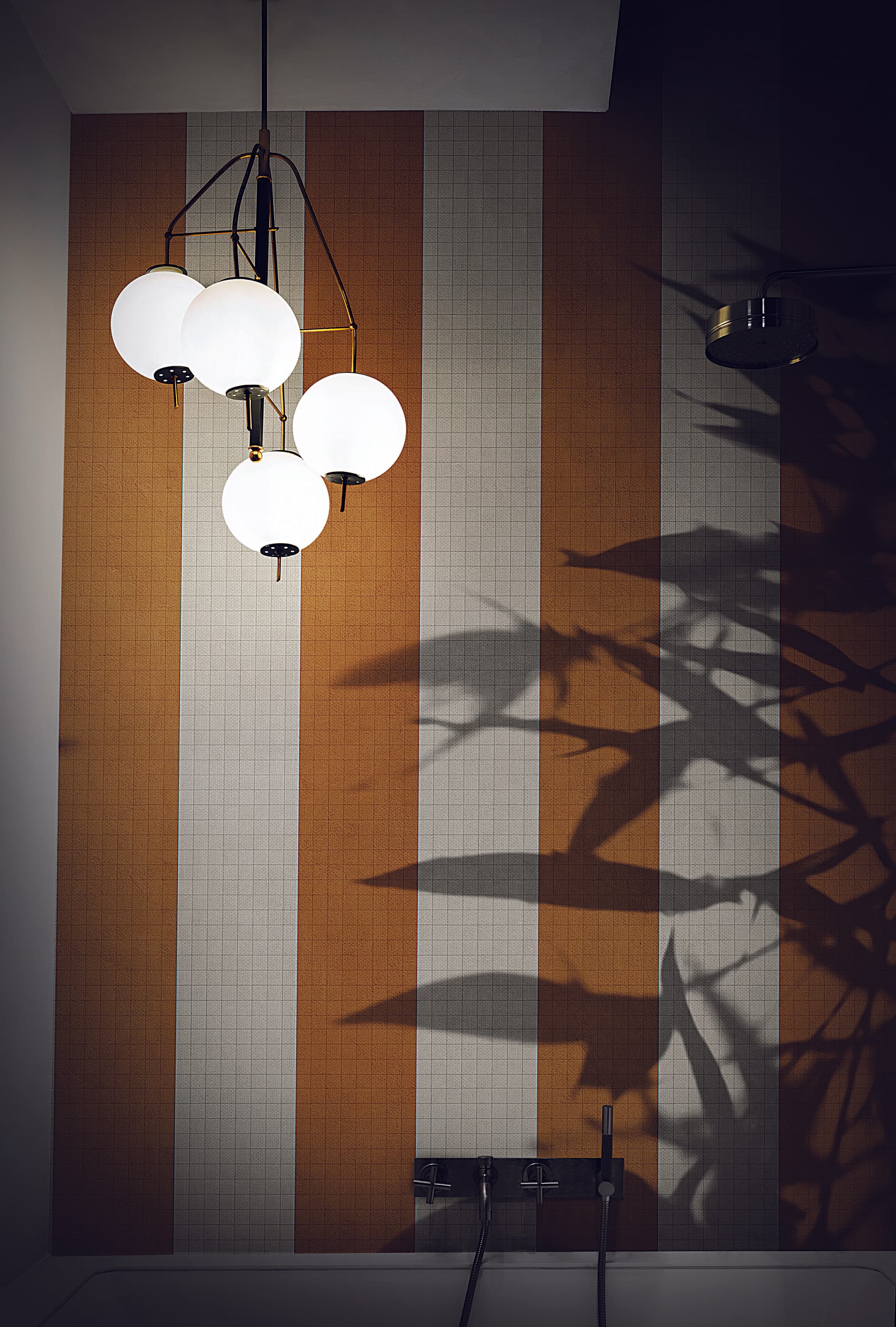
Contrast decides how much attention a striped wall draws. “The rigid structure of contrasting lines draws your attention to a focal point,” says the interior designer Roselind Wilson, while Marie Flanigan prefers “a subtle stripe that draws the eye upward and creates cohesion between the wall and ceiling”. A strongly contrasting stripe, such as the broad orange bands of Lungomare, therefore suits a feature wall, and a tone-on-tone or strié stripe suits a backdrop for furniture, art and patterned fabrics.
Width
Width sets the scale of the pattern: a pinstripe is very thin, and Florence’s bands are 13 centimetres wide. We found no study of how the width of a stripe changes a room; the one study we found that compared spacings measured clothing, where spacing changed the effect. Roselind Wilson stresses precision: “With stripes, you have to be mathematical and measured as any irregularities in the design or the wall will show”, she says, and she advises planning the wall from a stripe centred on it.
Choose the direction for where the eye should travel and the contrast for how much attention the wall should draw, then judge both at full size before you order.

How to pair striped wallpaper with other patterns
Designers pair stripes with other patterns by three rules: vary the scale, carry one colour through, and leave the eye somewhere plain to rest. A stripe can be that plain.
Vary the scale. Kit Kemp advises complementing “a large-scale traditional floral wallpaper or scenic mural design” with “sofas and armchairs in geometric prints or woven stripes”. Elizabeth Hay works the other way round: she might pair “a busy, small-scale floral” with “a much bolder stripe”, so that the patterns “aren’t fighting for attention”. Dara Caponigro, creative director of the fabric and wallpaper studio Schumacher, mixes “something large, medium, and small”.
Carry one colour through. “Color is usually the thread that pulls everything together for me,” says Elizabeth Hay, and Dara Caponigro asks for “a common color thread carried throughout”.
Let the stripe be the plain. Lauren Sullivan of Well x Design says stripes “almost serve as a ‘neutral’ pattern”, and Genevieve Bennett, head of design at Liberty Fabric, says that, like plain fabrics and paint colours, “the stripes can frame and anchor a scheme”. Around the patterns, solid colours give the eye space to rest.
Stripe on stripe. Stripes can also be paired with more stripes. Livingetc’s Oonagh Turner writes that when wide striped sofas are paired with thinner pinstripes, some horizontal and some vertical, the effect can be “beautifully rich and textured”. “When mixing stripes I think the key is to mix with more stripes,” says the stylist Sarah Corbett-Winder.
Some designs make the pairing for you. Anita (MRN02), by MARNI (the fashion house), lays teal roses over painted blue and white bands, and Serra (21028), by LondonArt, frames an ivy trellis with green and white striped drapes.
Vary the scale, carry one colour through, and give the eye somewhere plain to rest; a quiet stripe on the wall can be that plain.

Striped wallpaper in our range
These are the striped designs in our range, grouped by style and shown in rooms; the few without a room photograph are listed under their group’s pictures. LondonArt designs are printed to order in Italy at the width and height of your wall, on the material that suits the room; LondonArt's Unlimited textures are sold by the standard roll; Zambaiti Parati's wallpapers are sold by the roll; Zambaiti Parati's murals are printed in panels to fit the wall; and ExclusiveWallPanel designs are printed on aluminium panels with a resin coating finished by hand.
Classic stripes
Most classic stripes are named after cloth, as the table above shows: the pinstripe of a suit, the pencil stripe, and the tone-on-tone stripe, in shades of one colour, the family Florence belongs to. The tone-on-tone and strié stripes make the backdrop the section on contrast describes, for furniture, art and patterned fabrics.
Pinstripes, pencil stripes and canes
- Blitz
 Riccardo Zulato · Glass CollectionCode 18522
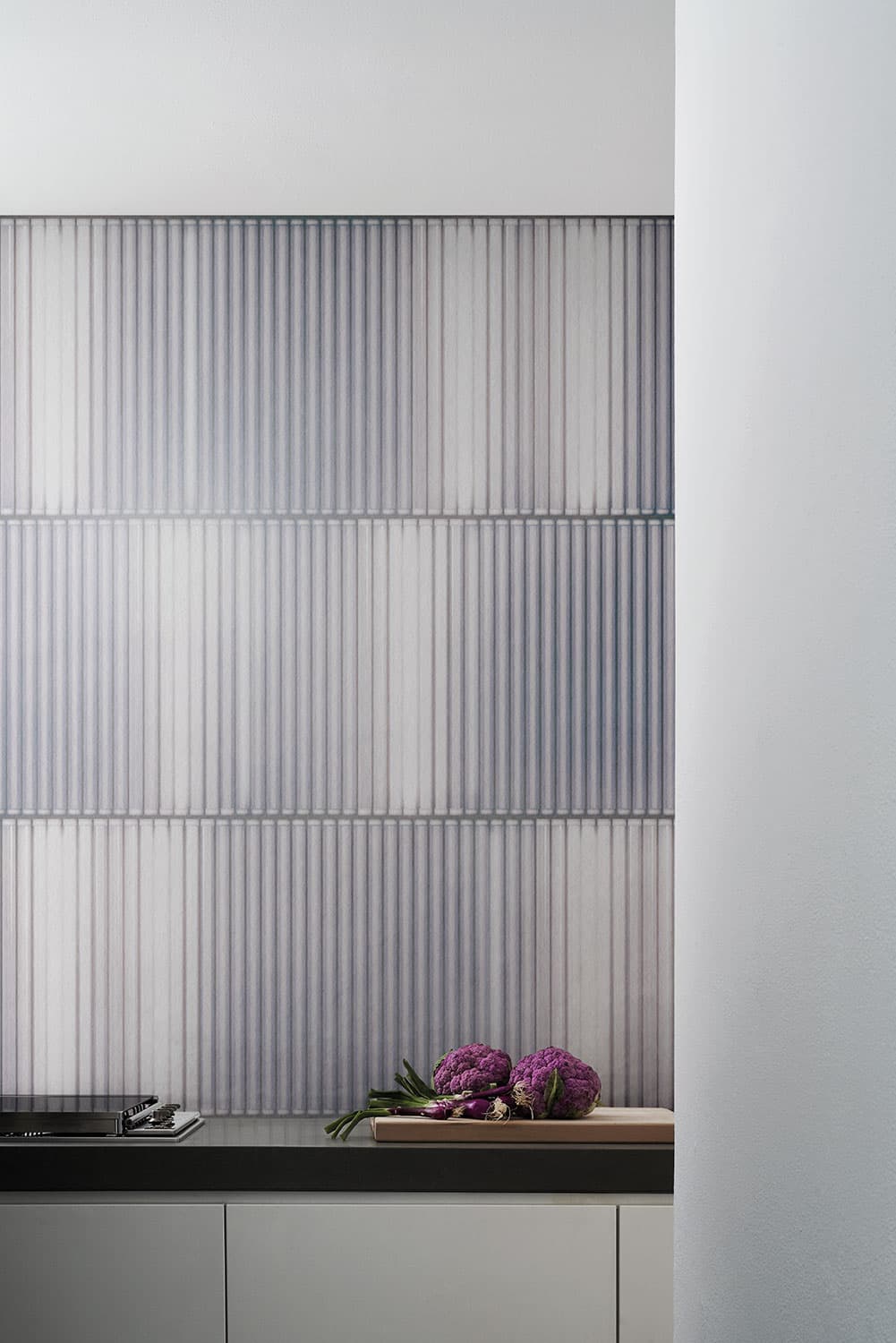
Fine blue, pink and grey lines of varying width on white.
- Elkann
 Riccardo ZulatoCode 19017 · 5 colourways
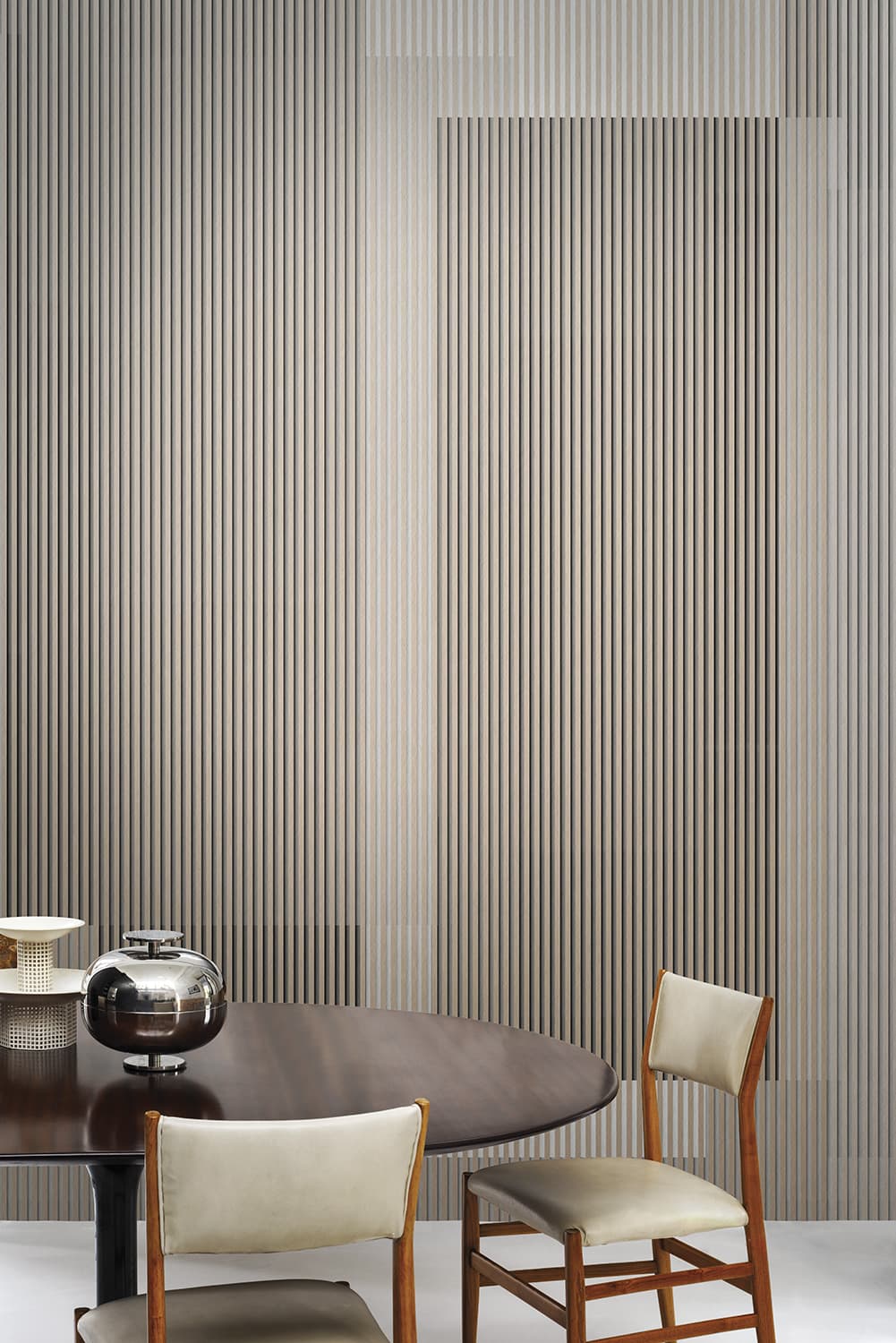
Fine pinstripes over the whole surface, with hard-edged blocks of colour showing through, here in pale greys and beige.
- Stripes
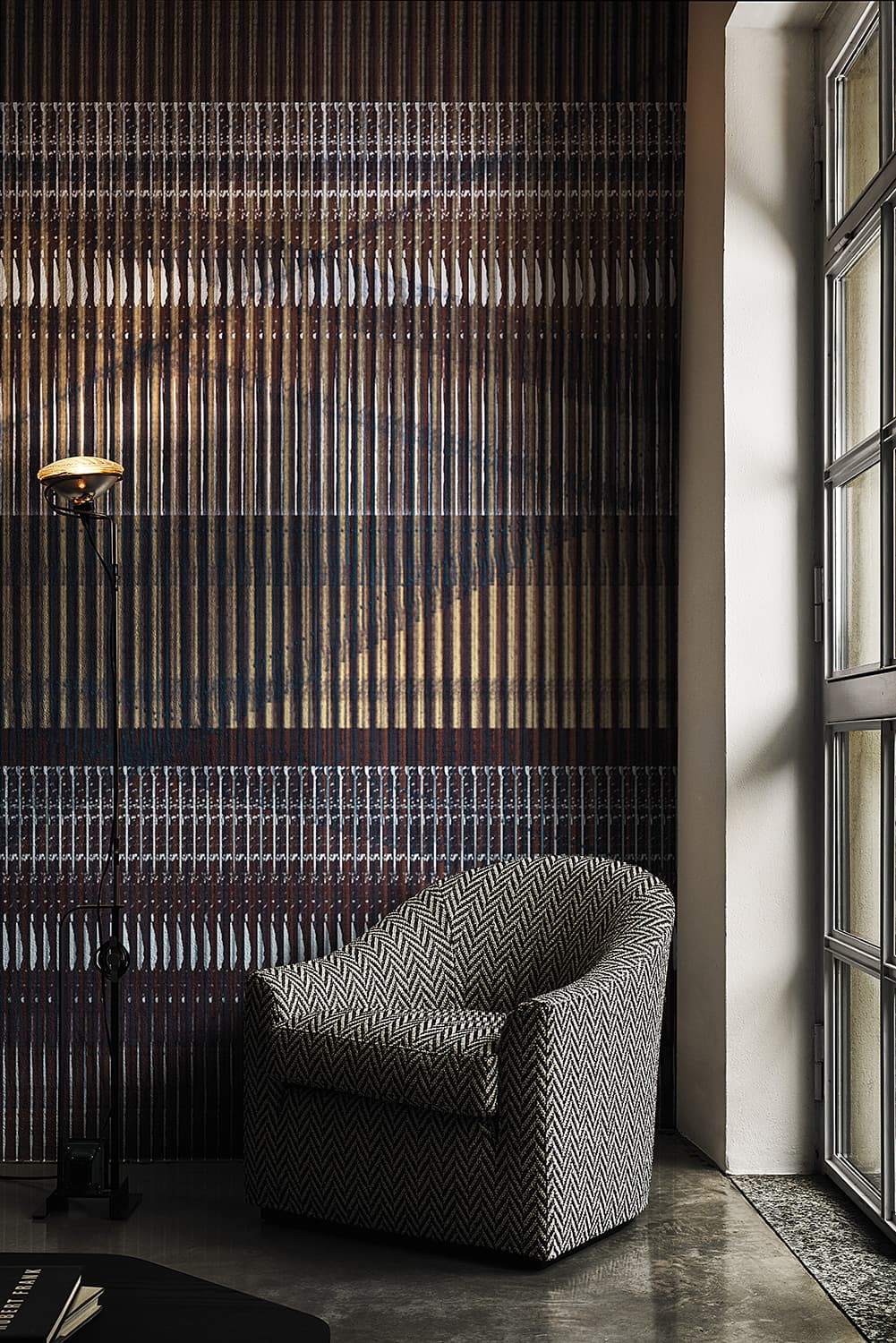 LondonArtCode 20059 · 3 colourways
Dense fine vertical lines in navy, ochre and burgundy, crossed by horizontal bands of small white marks.
- Soft Brush
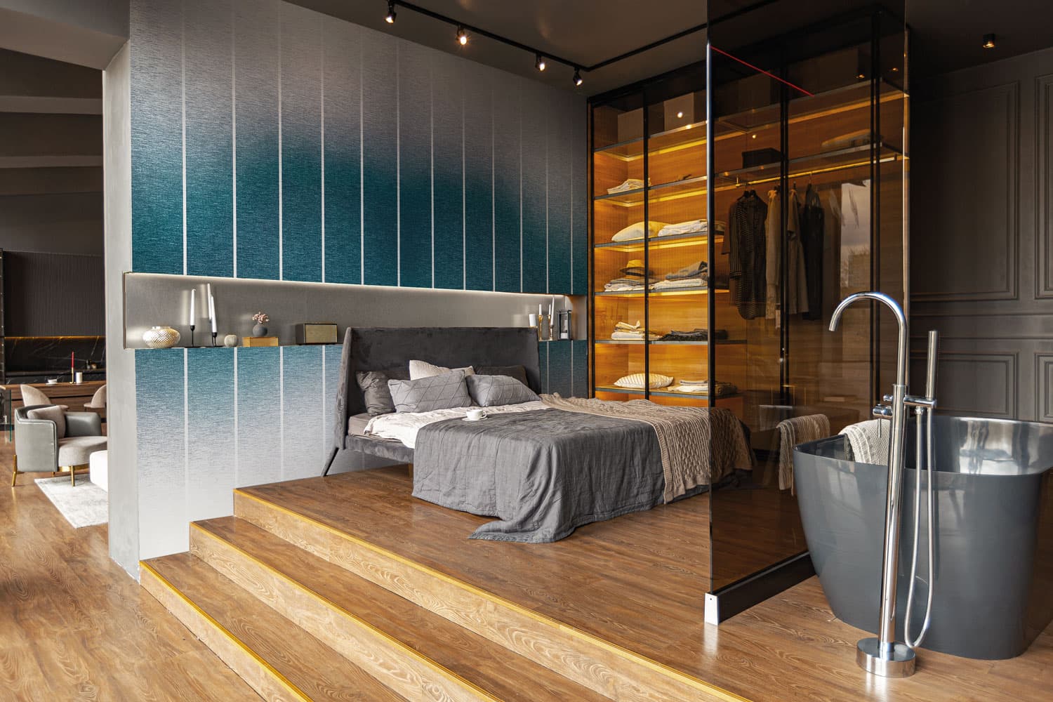 Fabio Fantolino · wall panelCode EWP1008 · 2 colourways
A brushed-metal look shading from teal to silver, crossed by evenly spaced thin light vertical lines.
- Levriero
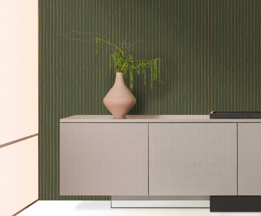 Zambaiti Parati · Trussardi Casa 8 · by the roll
The gold colourways of the bamboo-cane design: gold canes, evenly spaced on a green or brown ground, set a regular vertical rhythm across the wall.
Tone-on-tone and strié
For a backdrop, the quietest stripes keep to one colour family. Florence has its own section below.
- Levriero
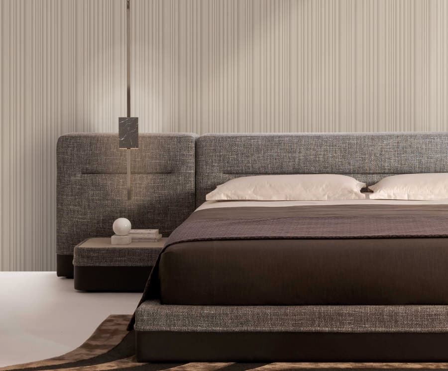 Zambaiti Parati · Trussardi Casa 8 · by the roll
Straight bands in shades of one colour with softly shaded edges, in beige, white, grey-lilac and charcoal: the nearest designs in the range to Florence.
- This is Always
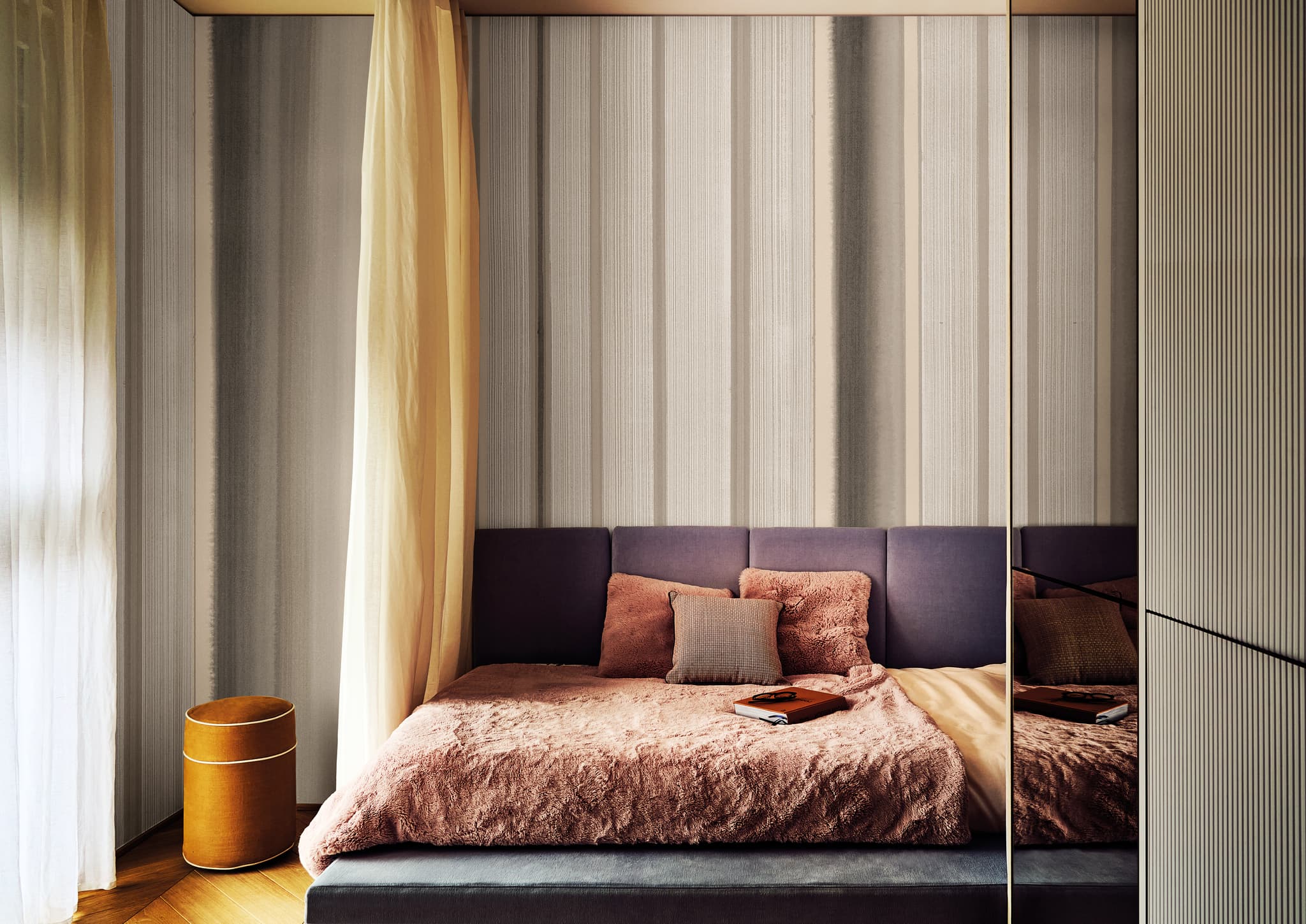 LondonArtCode 25025 · 4 colourways
Bands of varying width in close neutral tones, each finely streaked.
- Nuvia
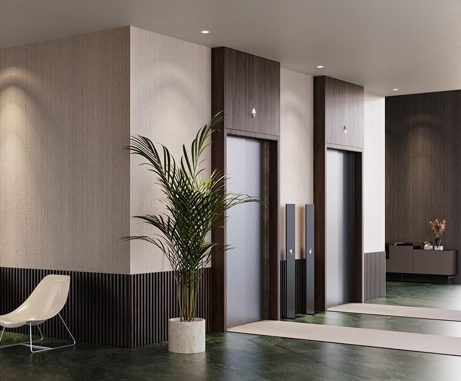 Zambaiti Parati · HOME · by the roll
Strié: fine, irregular lines running up the wall, in eight colourways from cream and sage to blue and white and a dark brown.
- Trussardi Casa 7
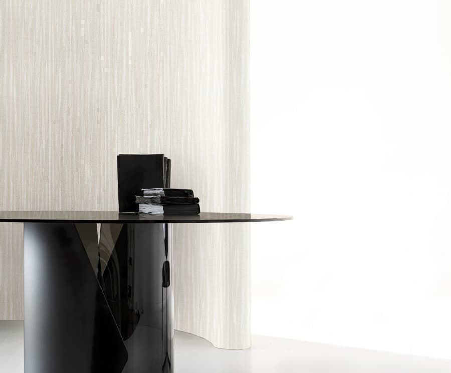 Zambaiti Parati · Trussardi Casa 7 · by the roll
Strié in taupe and olive, creams, pale greys and golds; Z18911 is gold and brown on black.
- Levriero
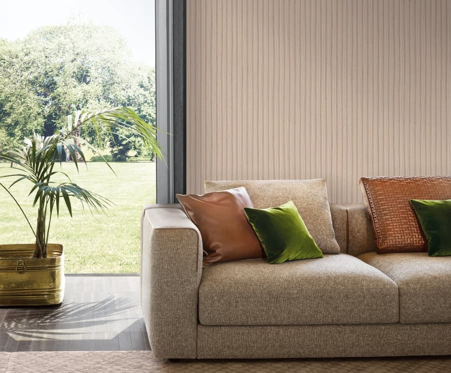 Zambaiti Parati · Trussardi Casa 8 · by the roll
The pale colourways of a bamboo-cane design, in sand, pale grey and taupe: across the wall the canes read as fine irregular vertical lines, and their joints show only close up.
- Cool Out
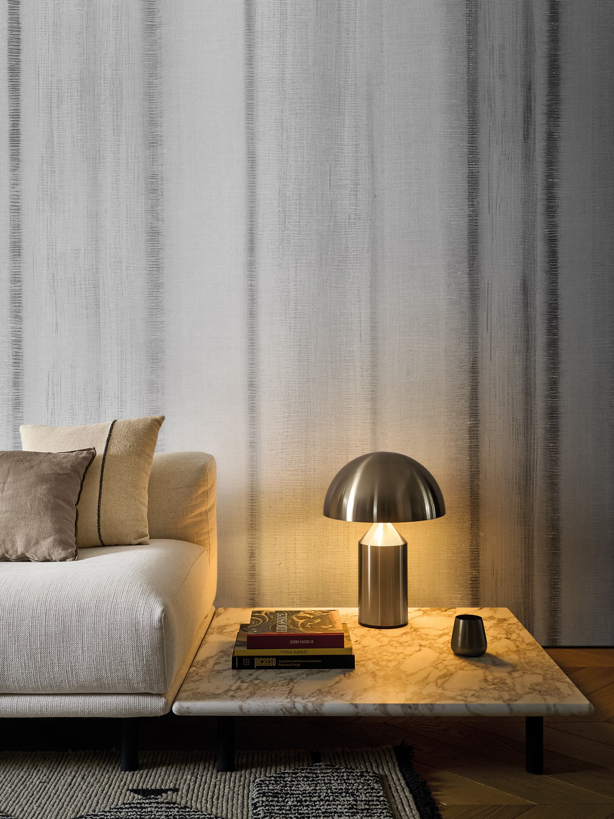 LondonArtCode 25027 · 4 colourways
Soft vertical streaks over a pale, fabric-like ground.
- Bronze Rain
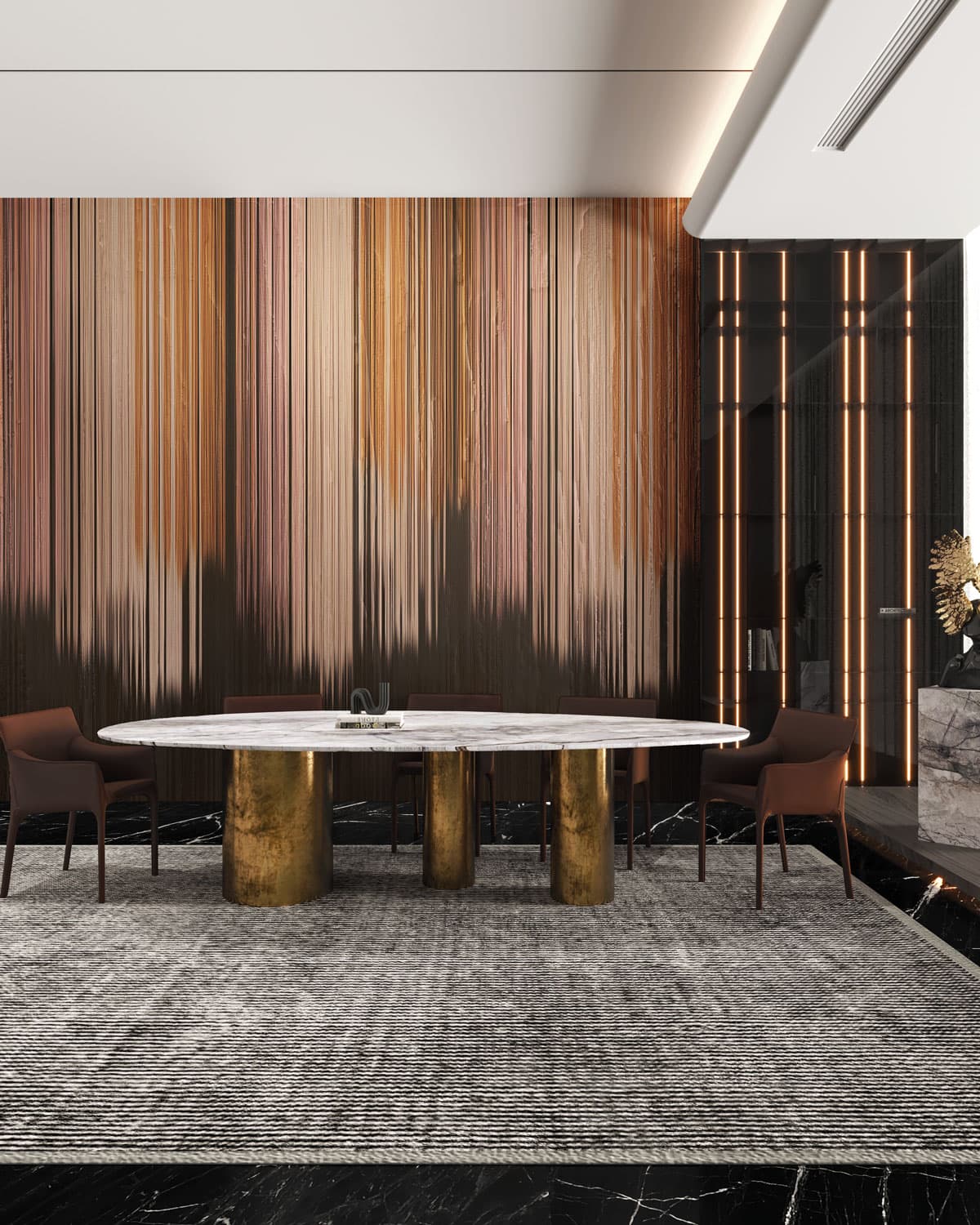 Fabio Fantolino · wall panelCode EWP1010 · 2 colourways
Dense fine lines in copper, pink and brown running the height of the panel and fading into dark at the base.
- Striated Metal
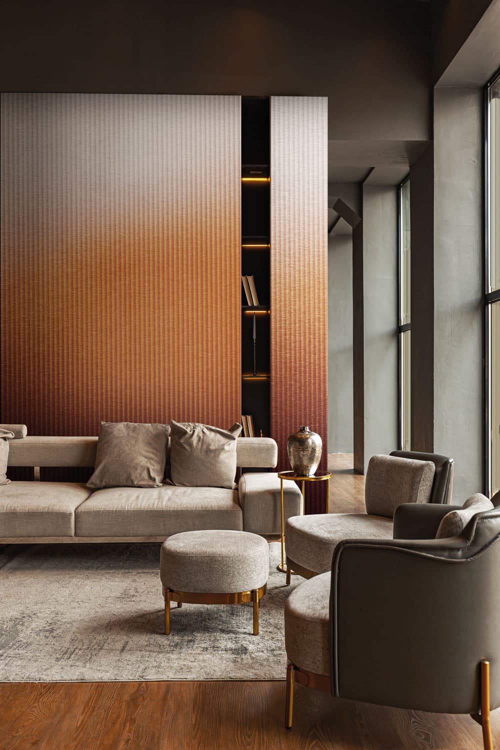 Fabio Fantolino · wall panelCode EWP1007 · 2 colourways
Fine, regular vertical striations over the whole panel, which shades from grey-mauve through amber to burgundy.
- Bordeaux
 LondonArt Studio · Unlimited · by the rollCode BOR · 18 colourways
Fine, straight vertical grooves of uneven width and spacing, tone on tone, with a sheen.
- Barcelona
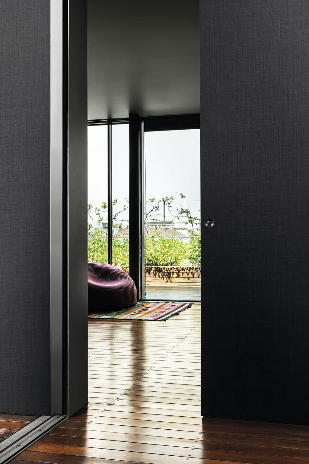 LondonArt Studio · Unlimited · by the rollCode BAR · 10 colourways
Fine, wavy, irregular threads running up the whole surface, with darker streaks.
- Sofia
 LondonArt Studio · Unlimited · by the rollCode SOF · 18 colourways
A near-plain ground whose fine, wavy vertical ribs run up the whole surface at low contrast.
- OsloLondonArt Studio · Unlimited · by the rollCode OSL
Fine, irregular light streaks running up the whole surface.
- CapriLondonArt Studio · Unlimited · by the rollCode CAP
A woven texture with fine horizontal streaks over the whole surface, crossed at intervals by thin twisted-yarn lines.
- LevrieroZambaiti Parati · Trussardi Casa 8 · by the roll
Strié of soft vertical folds that wander, cross and rejoin across the whole wall, in taupe, peach-beige, grey-lilac, white and charcoal.
- LamborghiniZambaiti Parati · Automobili Lamborghini 2 · by the roll
Fine continuous vertical lines with columns of short dashes.
Milanese Deco
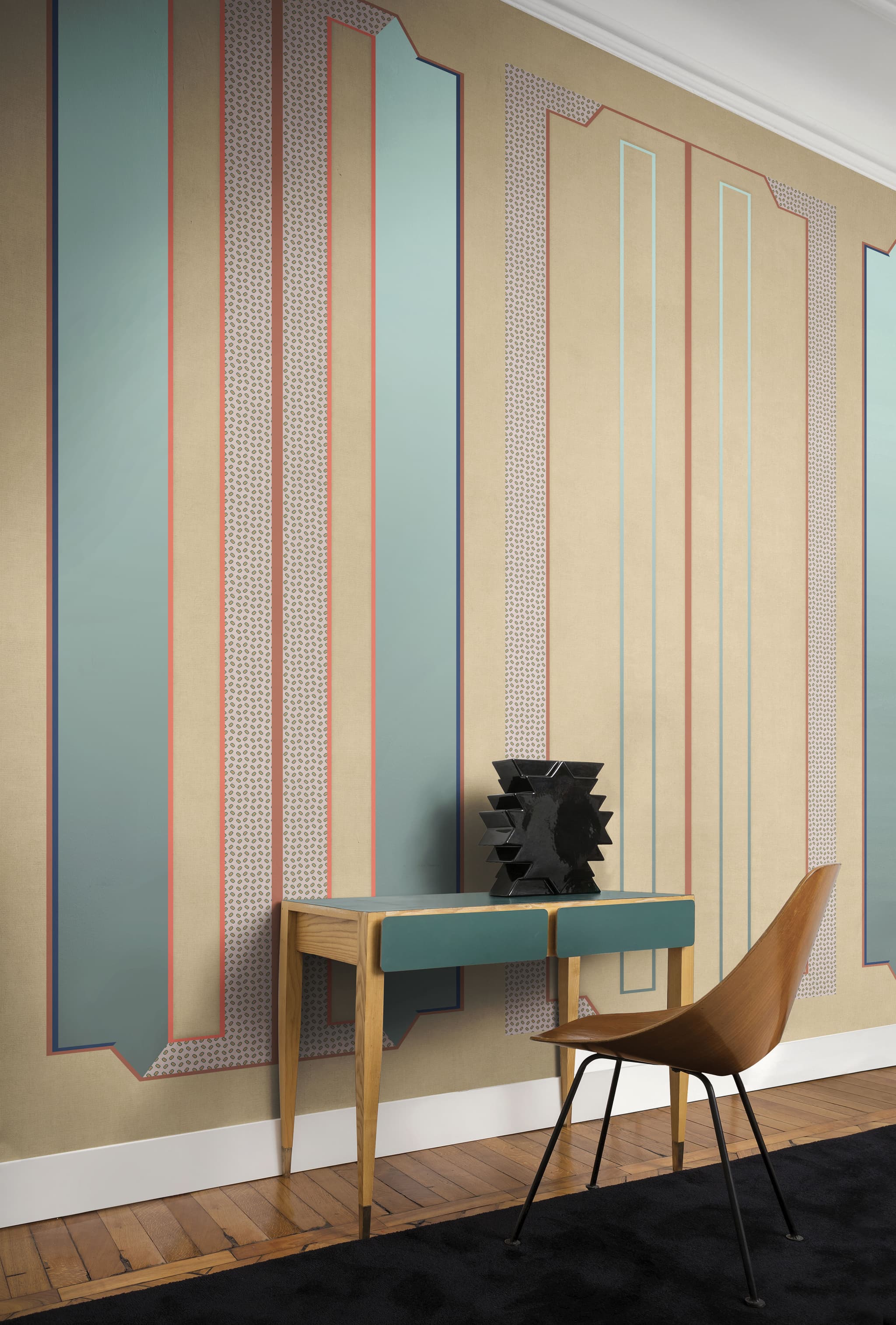
We call this group Milanese Deco. Its stripes are drawn as architecture, as columns, arches, panelling and framed panels, in the geometric manner of Art Deco as Milan’s architects practised it in the 1920s and 1930s. The Getty’s Art & Architecture Thesaurus describes Art Deco as a style of those two decades, “often with an emphasis on rectilinear motifs, vibrant colors, and elegant, abstracted, simplified forms.”
The Treccani encyclopedia names Gio Ponti among the Italian draughtsmen, decorators and architects who drew close to déco, and its biography of the architect Piero Portaluppi describes his déco vocabulary of around the 1930s as an elegant, zigzagging alternative to Ponti’s Neoclassicism. In the first issue of the magazine Domus, in January 1928, Ponti wrote that “In the Italian House there is little distinction between exterior and interior architecture” (in the magazine’s own English translation). These designs carry that idea onto the wall.
Three studios in Milan describe their work in these terms. Marcante-Testa, the architects behind Tre and Sciù Sciù, call their LondonArt collection “a research of the balance between decoration and architecture.” Cristina Celestino, whose studio is in Milan, writes that Coleotteri “draws inspiration from the insect display cases of the Natural History Museum in Milan.” And the Milan practice Dimore Studio, describing a project inspired by Art Deco, puts the approach in one line: “We were inspired by the language of Italian design from the 1930s and 1940s, reinterpreted in a modern way.”
In several of these designs the stripe is one part of a larger composition: bands between tiles, panels of pinstripes, a ground behind arches.
- Tre
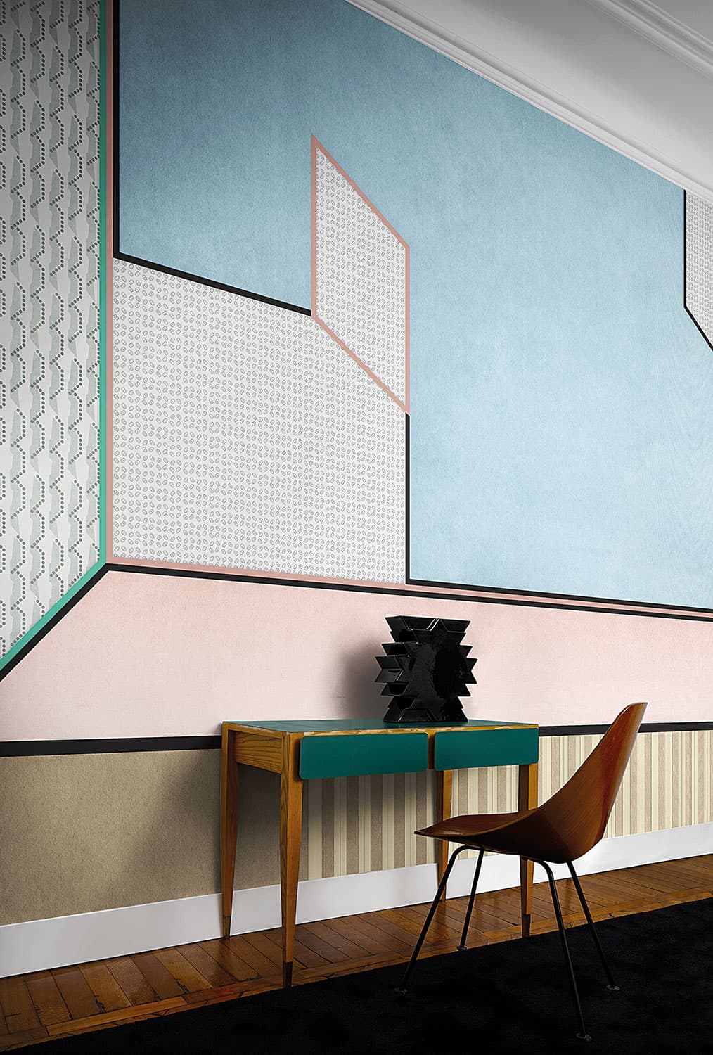 Marcante-TestaCode 18015
Tall bands of beige, blue and pink edged with fine coral lines, as in the room at the top of this guide. LondonArt also pictures Tre as panels: a pale blue field outlined in black and coral, above a band of pink.
- Portici
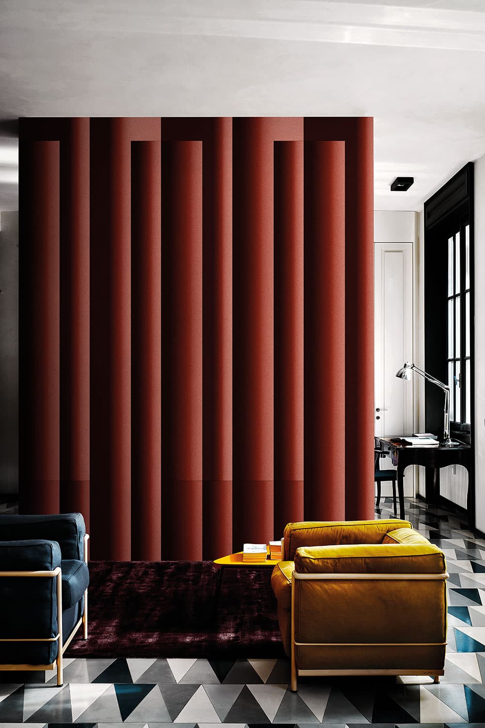 BellavistaPicciniCode 19006 · 5 colourways
Red-brown bands, each shaded from dark to light across its width.
- Lungomare
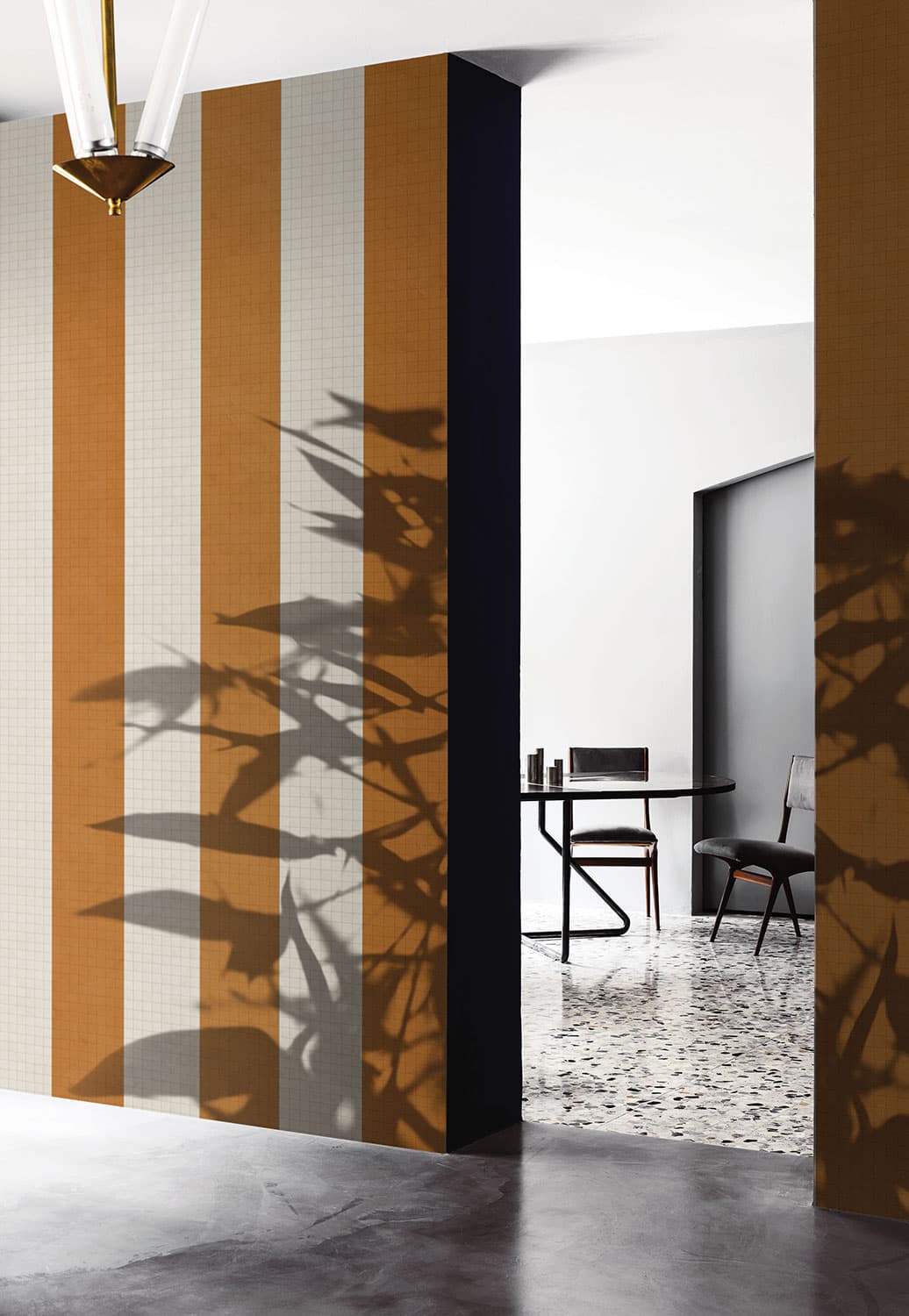 Cristina Celestino · Glass CollectionCode 18503
Broad orange bands alternating with pale bands that carry a fine tile grid: a high-contrast stripe for a feature wall.
- Coleotteri
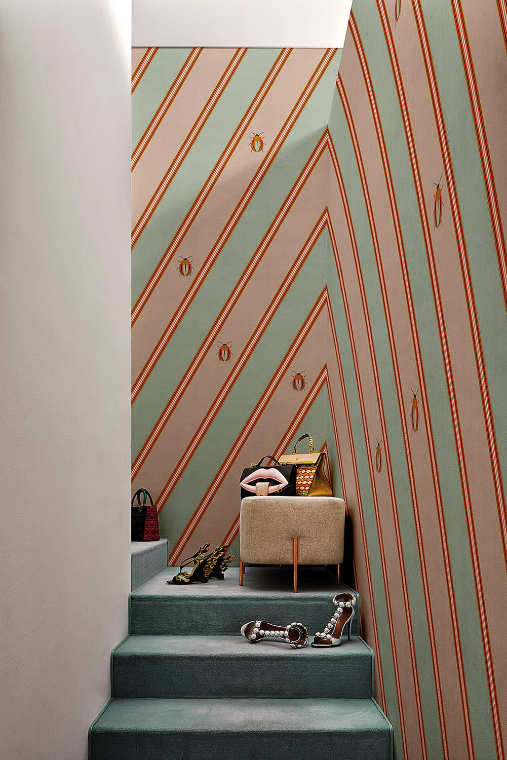 Cristina CelestinoCode 19002 · 4 colourways
Groups of fine rust lines running diagonally between sage and blush bands.
- Assemblage
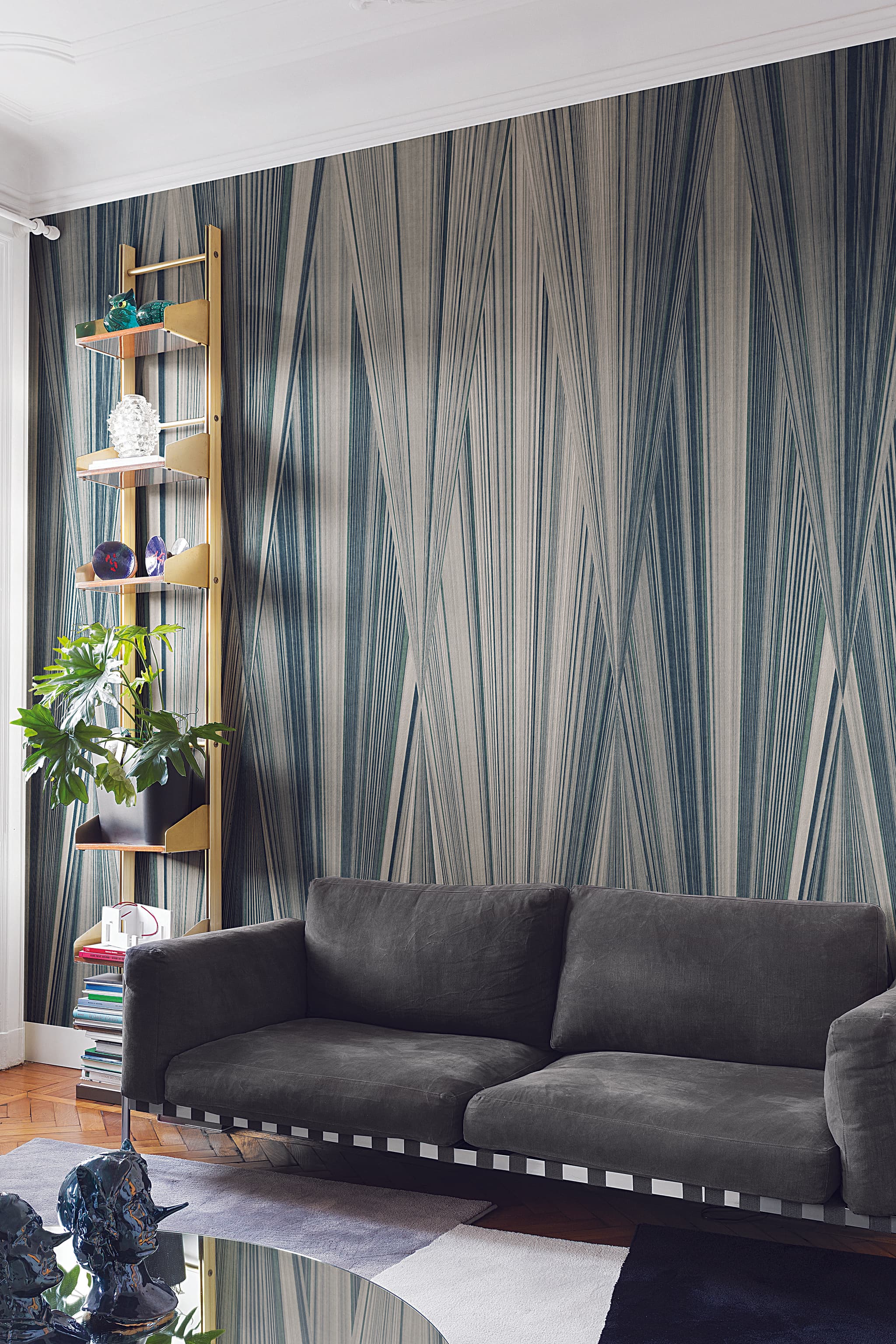 Cristina CelestinoCode 18006
Fine teal, green and cream lines running the height of the wall, slanting slightly so that they meet in tall, narrow wedges.
- Maniera
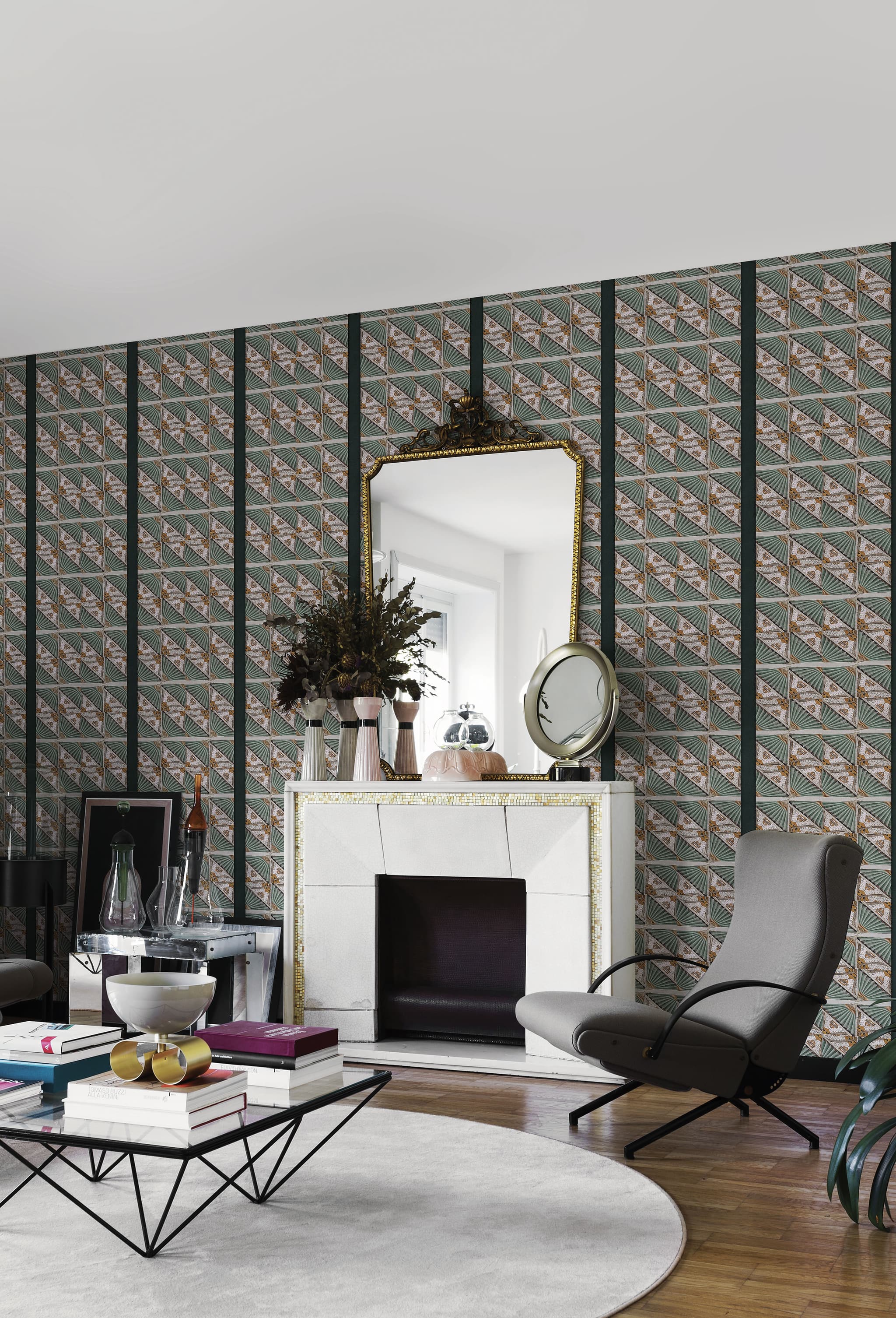 Cristina CelestinoCode 18005
A pattern of sage fans and blush triangles, divided by broad dark-green vertical bands.
- Sciù Sciù
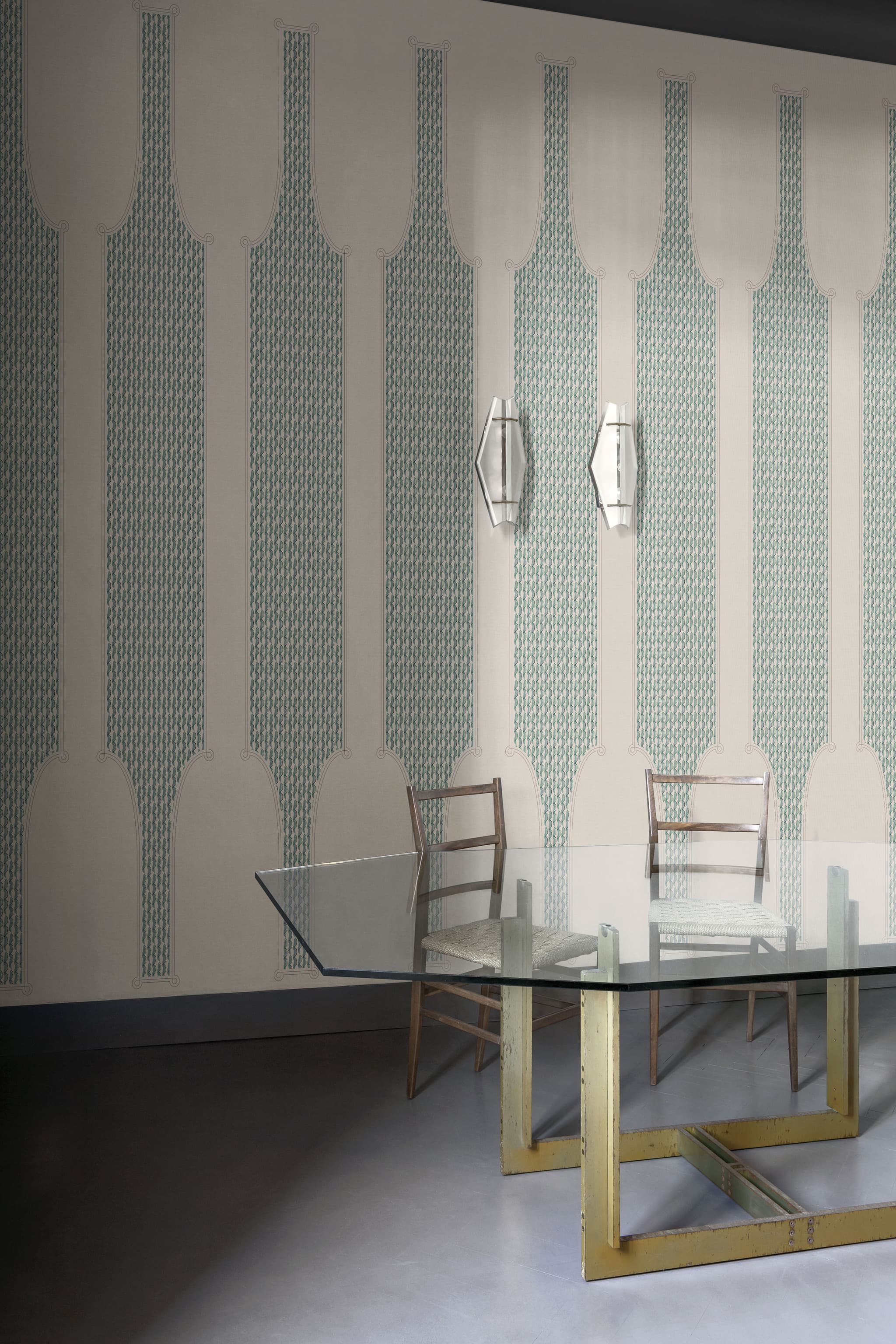 Marcante-TestaCode 18017
Full-height teal and cream bands that taper and flare, filled with a small mosaic and finished with scrolls.
- Dynasty
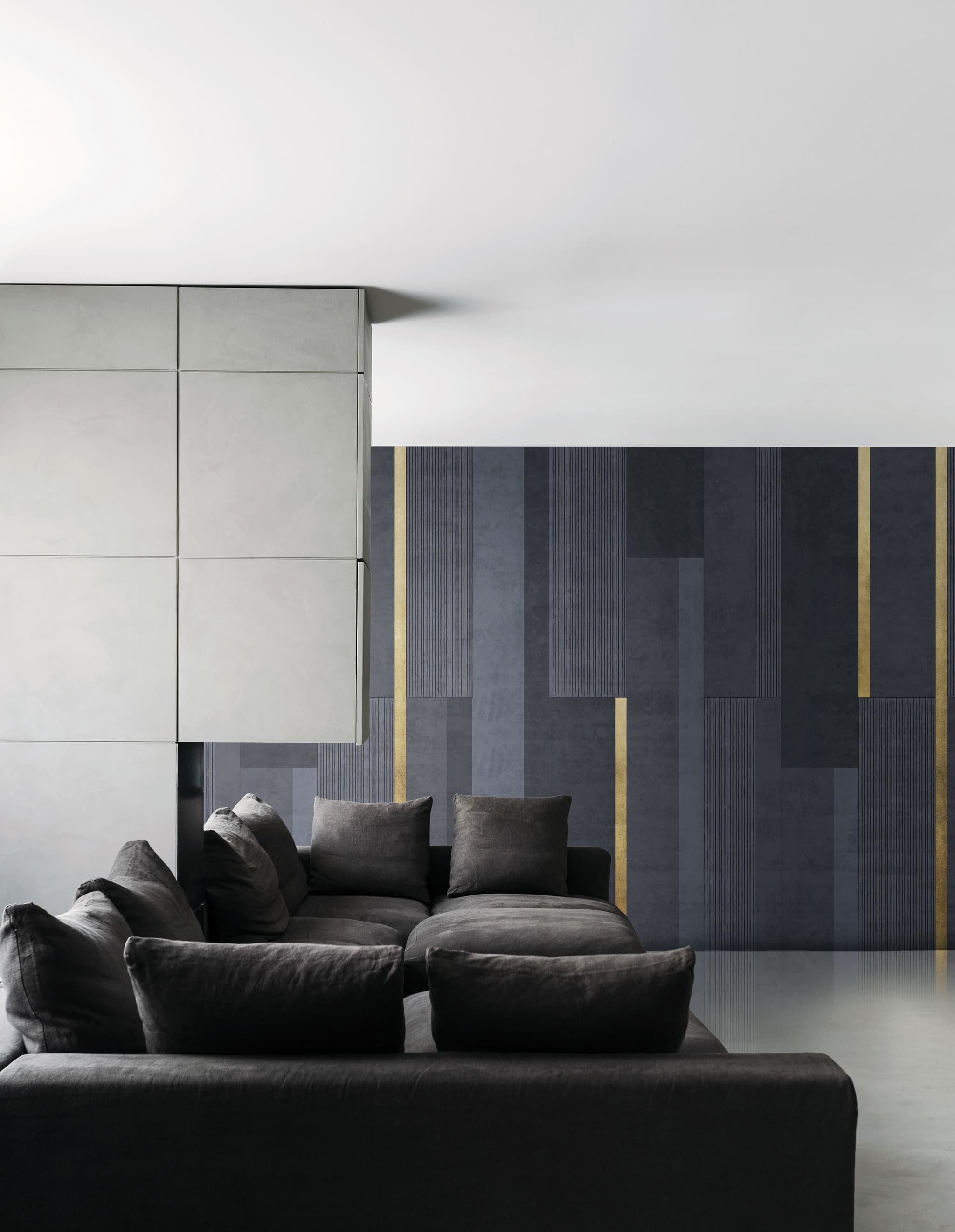 Carlo ColomboCode 18009
Vertical blocks of charcoal and navy plaster, some finely pinstriped, with flat bars of gold leaf.
- Layers
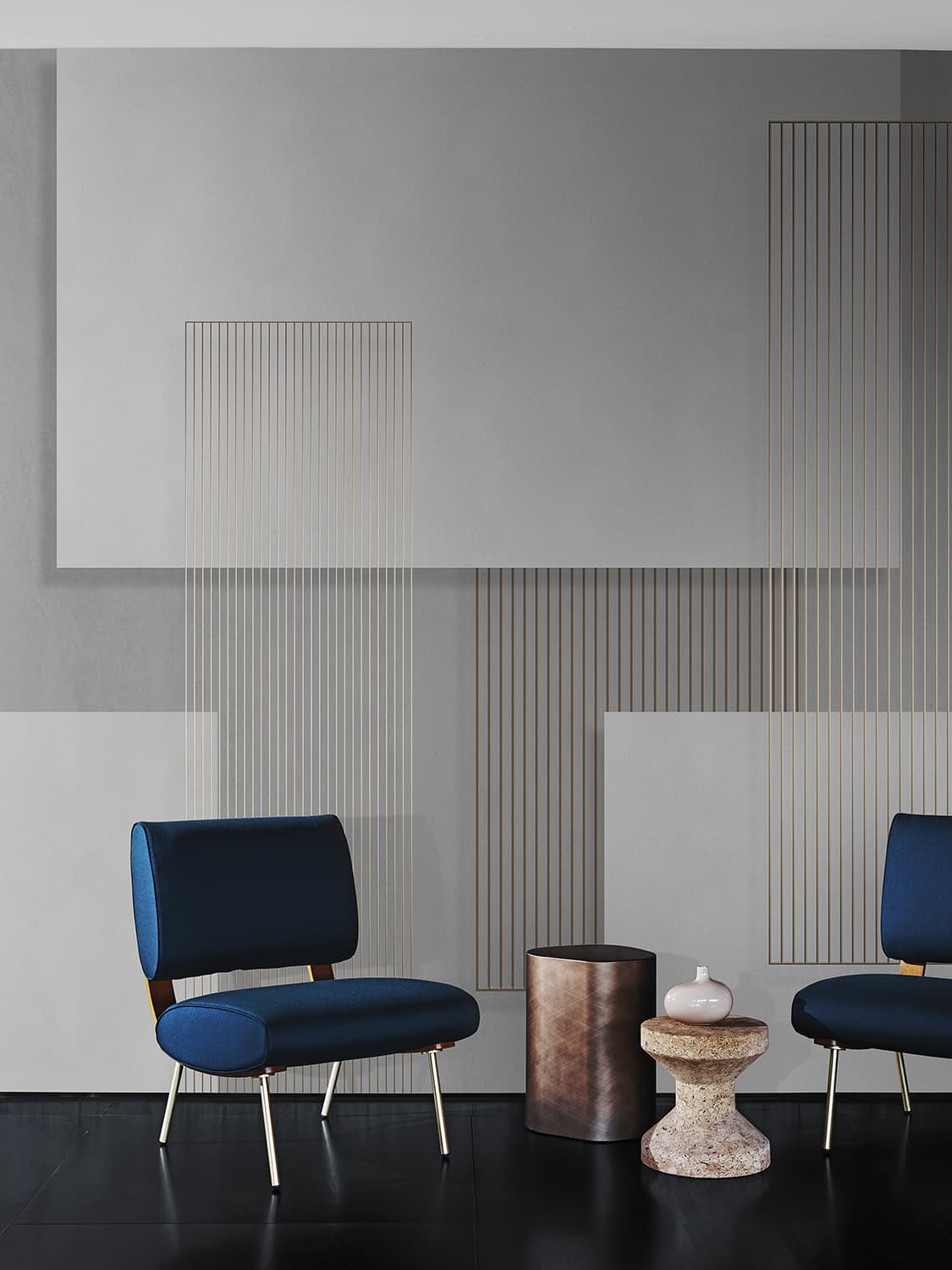 Carlo ColomboCode 19030 · 7 colourways
Overlapping rectangles on a plaster ground, with framed panels of fine vertical lines, here in greys and white.
- High Lighter
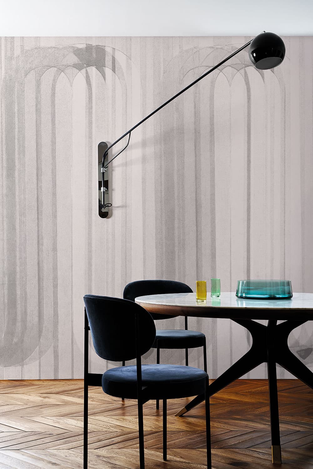 Valeria ZaltronCode 19065 · 3 colourways
Tall, overlapping round-headed arches over full-height bands, here in pale greys.
Nouveau
Art Nouveau, the style of about 1890 to 1910, took its lines from nature: the Getty’s thesaurus describes “an emphasis on fluid, undulating, or serpentine lines or contours based on organic forms”. In Italy the style is called Liberty, after Liberty and Co., the London shop that, the Treccani encyclopedia notes, specialised in goods from the Far East.
In these designs a motif is set over or within a striped ground, so the stripe is one of two patterns and the design makes its own pairing: flowers, embroidered leaves, a vine on a trellis, shells, bamboo, a pine. Carlo Dal Bianco says that his Bruxelles reinterprets a bouquet of flowers from a Flemish painting, and that its stripes recall ribbed ribbons, wood panelling and Italian furniture of the 1940s.
- Bruxelles
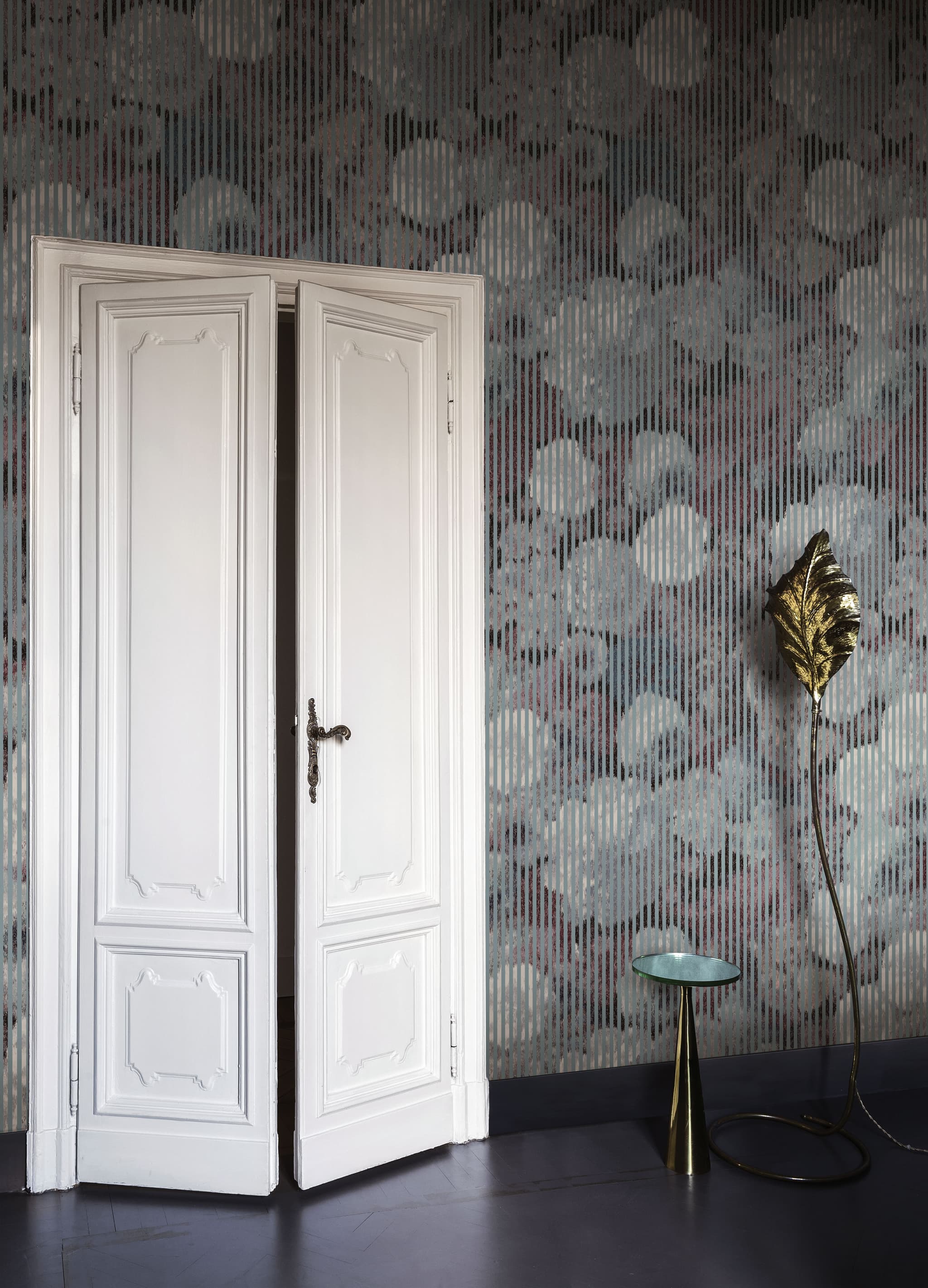 Carlo Dal BiancoCode 18051
Grey-blue vertical stripes over a dense field of round flower heads in grey-blue, mauve and burgundy.
- Broderet
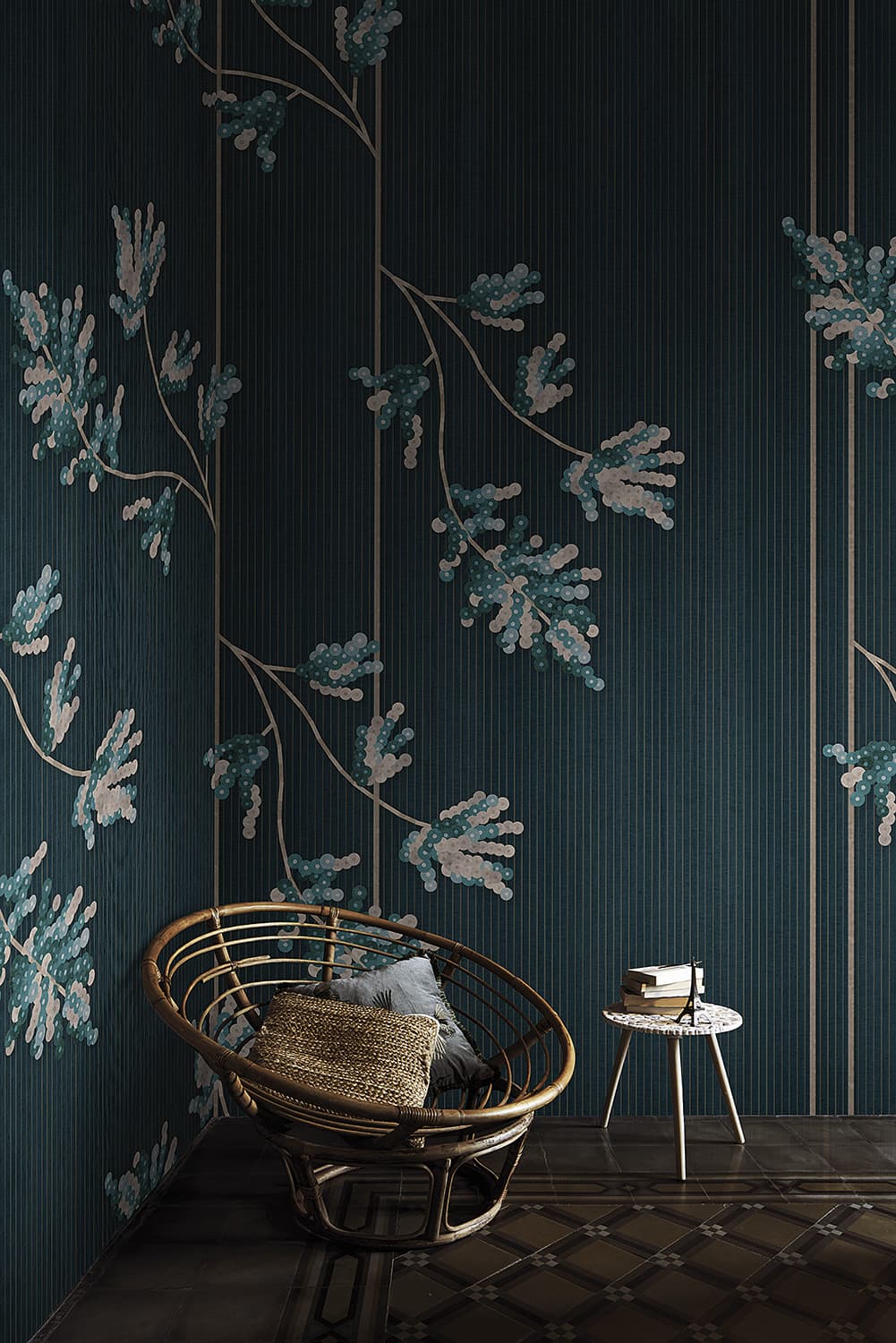 LondonArtCode 21024 · 3 colourways
Sprays of sequin-embroidered leaves on gold stems, over a deep teal ground of fine pinstripes and gold lines.
- Serra
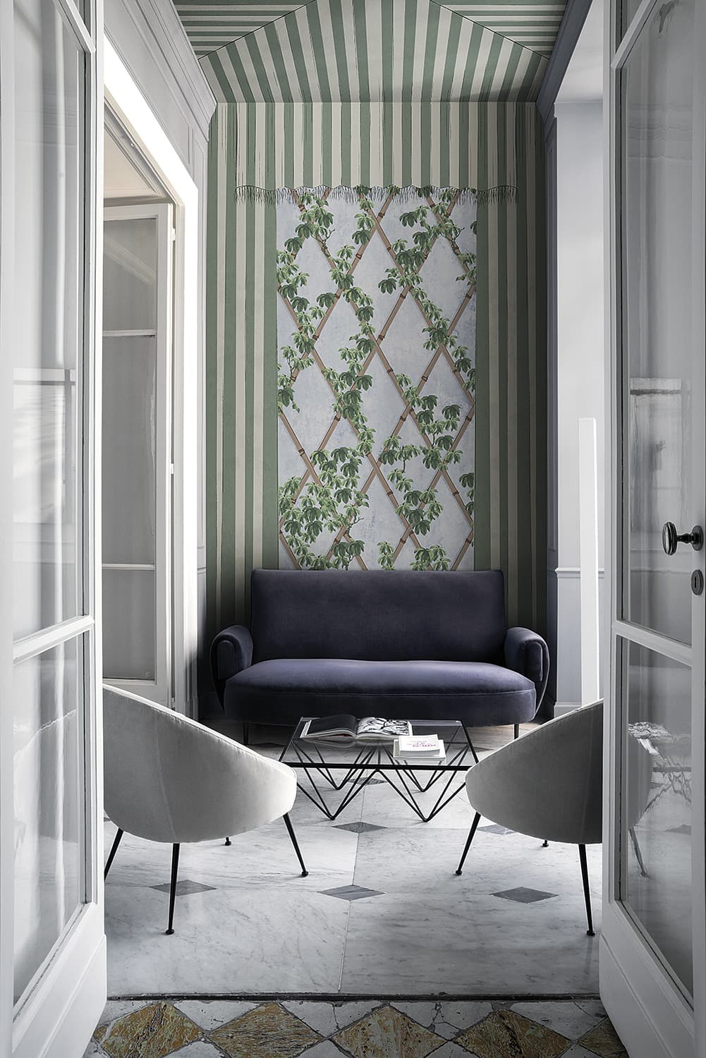 LondonArtCode 21028 · 3 colourways
Sage-and-cream striped drapes with fringed pelmets frame a diagonal bamboo trellis climbed by green vines.
- Tara
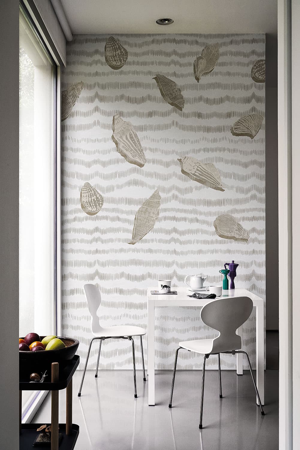 LondonArtCode 19521 · 2 colourways
Seashells over horizontal bands of fine hatching, here in greys and sand.
- Virtual Emotion
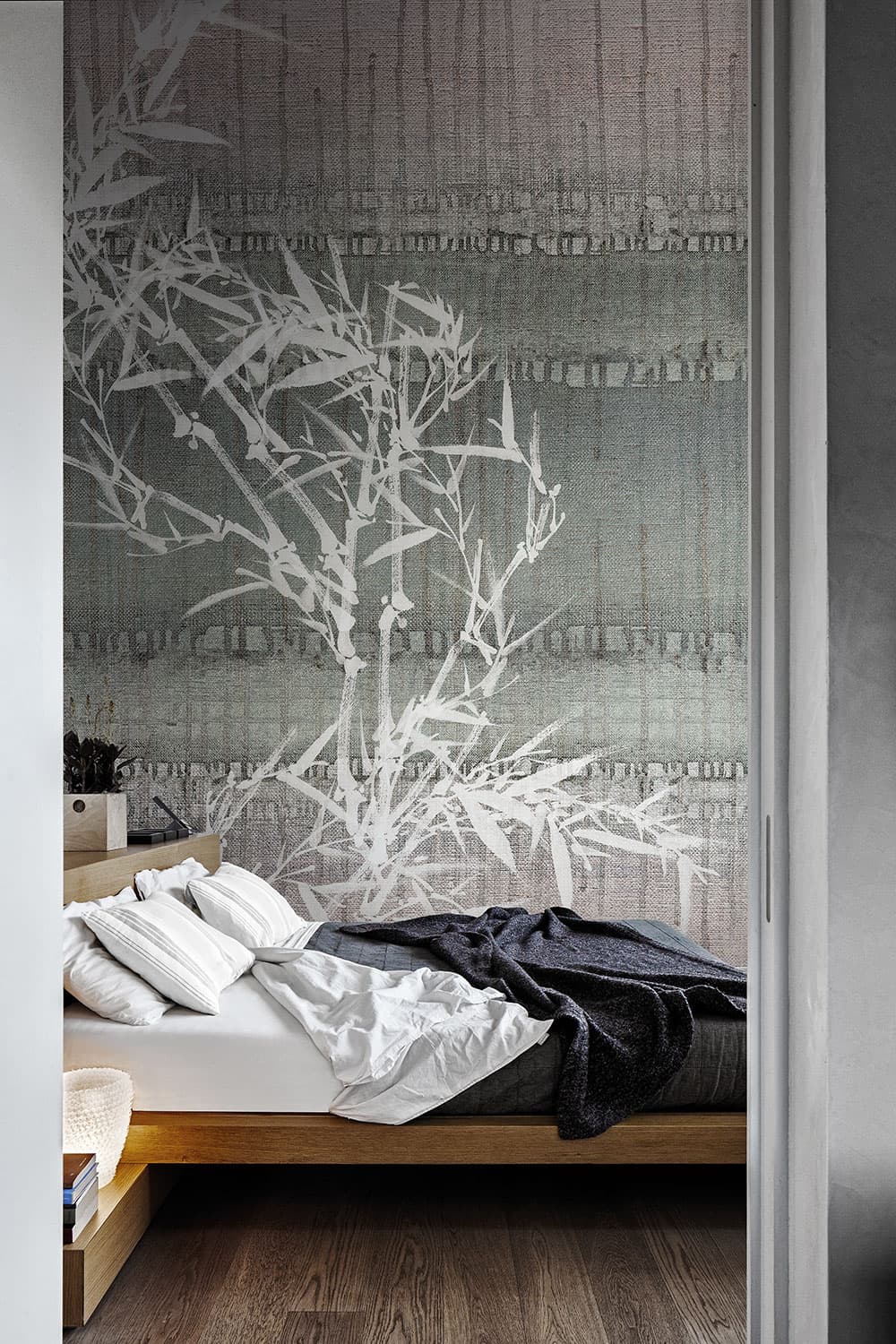 LondonArtCode 16088 · 2 colourways
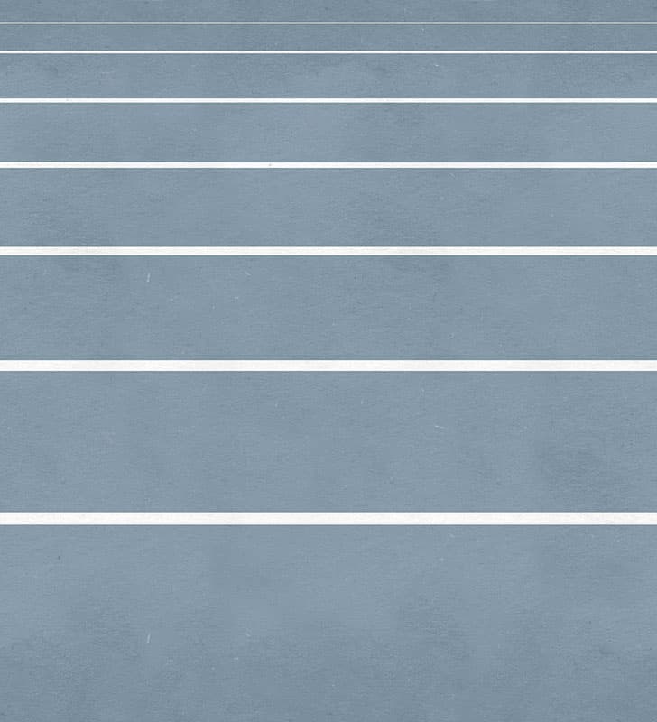
A white bamboo spray in ink brushwork over broad horizontal bands of dyed grey.
- Plague
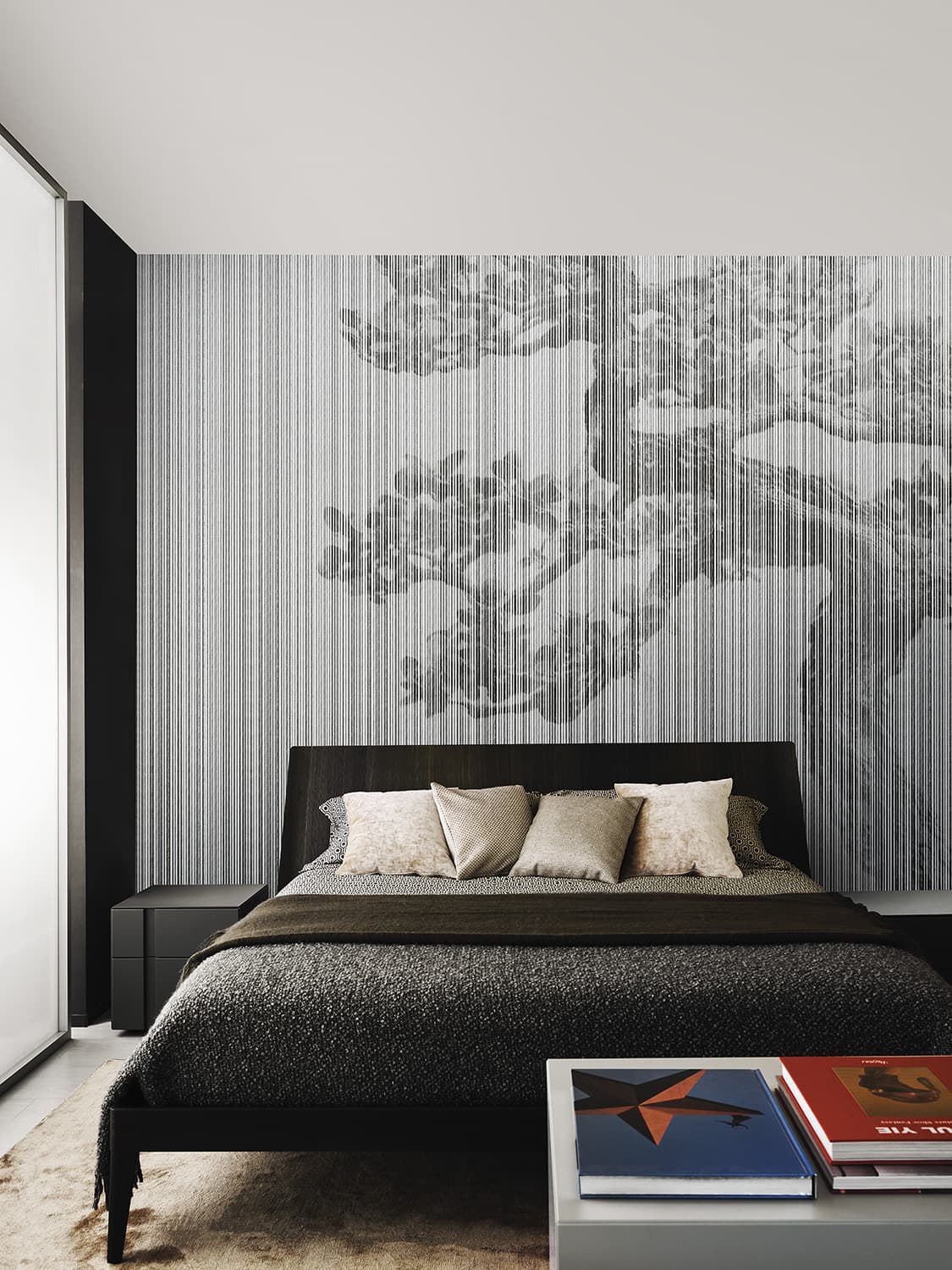 LondonArtCode 20016 · 4 colourways
A gnarled pine in East Asian ink-painting style, behind a screen of fine vertical lines.
Painterly and ombré stripes
These stripes are soft in edge or in tone: the wavering bands of a brush, watercolour bands that bleed into one another, blurred bands, and ombré bands, whose tones fade or step from one to the next. Three come from MARNI, the fashion house. With no motif to read, they bring movement to a wall through the edge or the tone of the stripe alone.
- Nostalgia
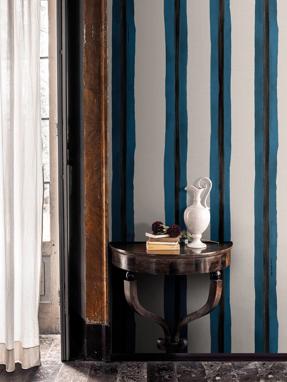 MARNICode MRN07 · 6 colourways
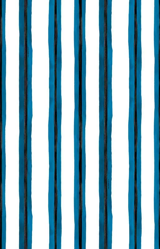
Broad blue bands with hand-painted, wavering edges on white.
- Streams
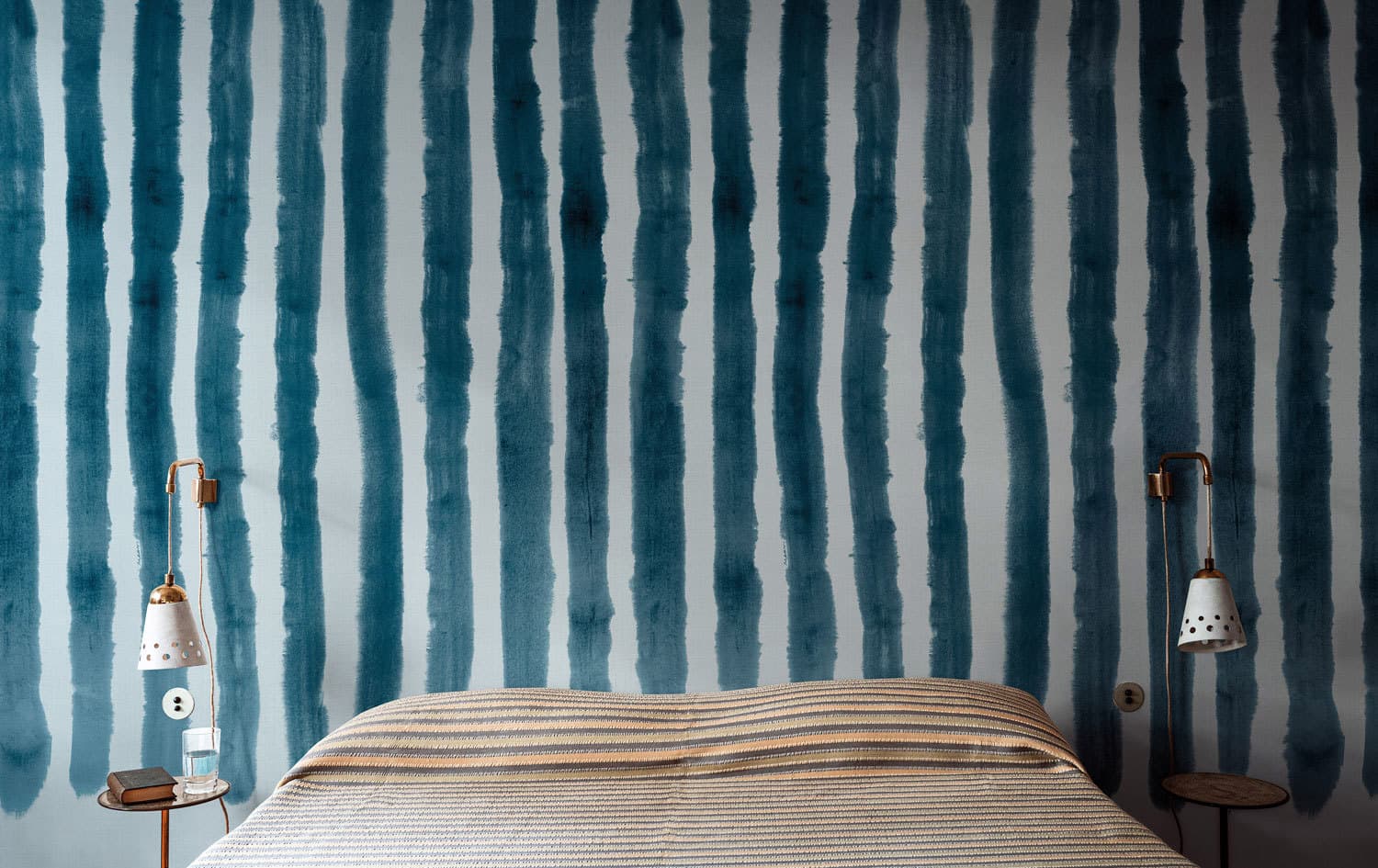 MARNICode MRN11 · 3 colourways
Dark blue brushstroke bands on pale blue.
- Soft Stripe Clouds
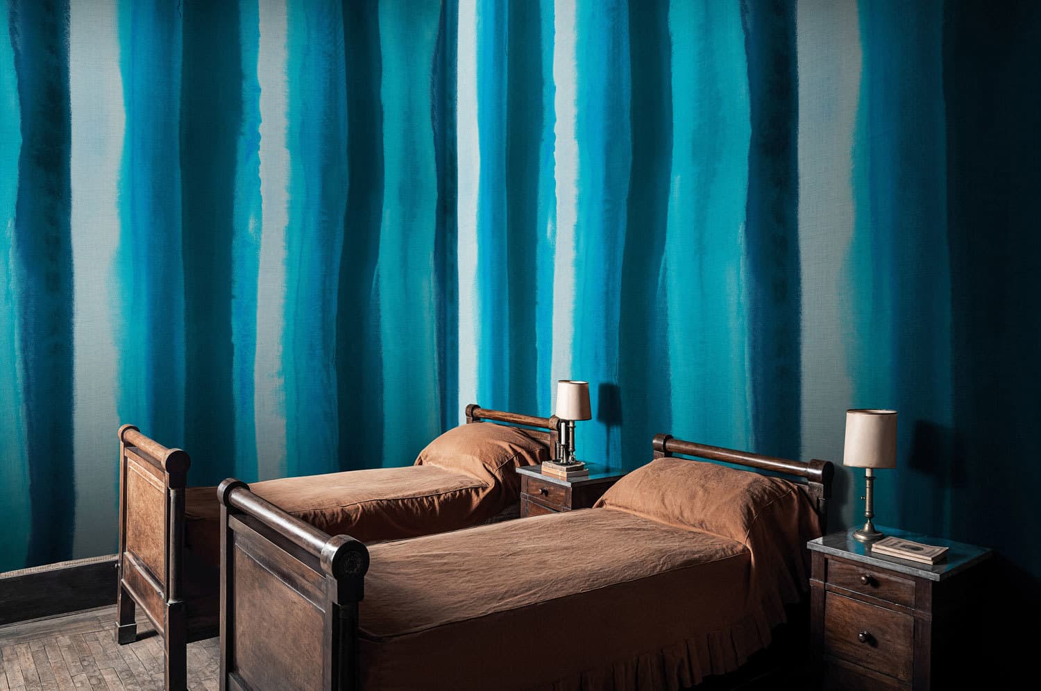 MARNICode MRN04 · 5 colourways
Broad watercolour bands in blues of varying width and depth.
- Melbourne
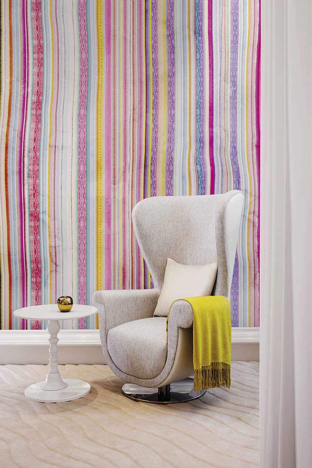 Marcel WandersCode 04MW · 2 colourways
Multicoloured bands of varying width with watercolour edges.
- Agatha
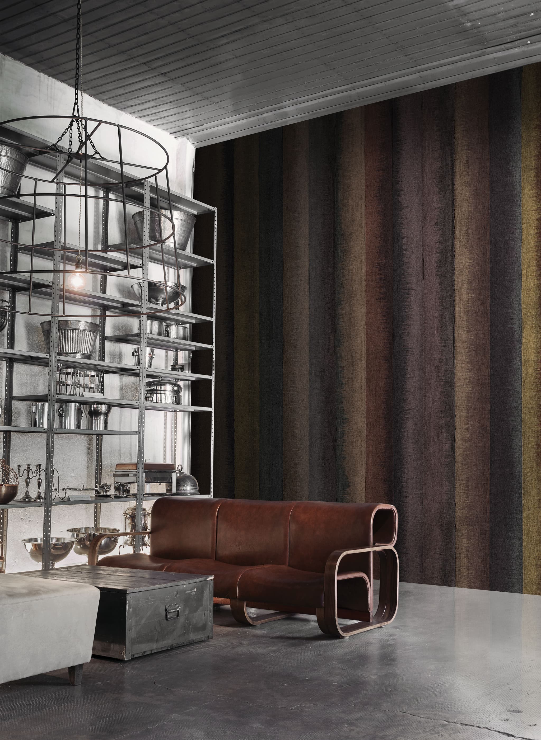 Alba FerrariCode 18120
Broad vertical bands of irregular width in black, brown, rust, ochre and plum, each dry-brushed like linen.
- daydream
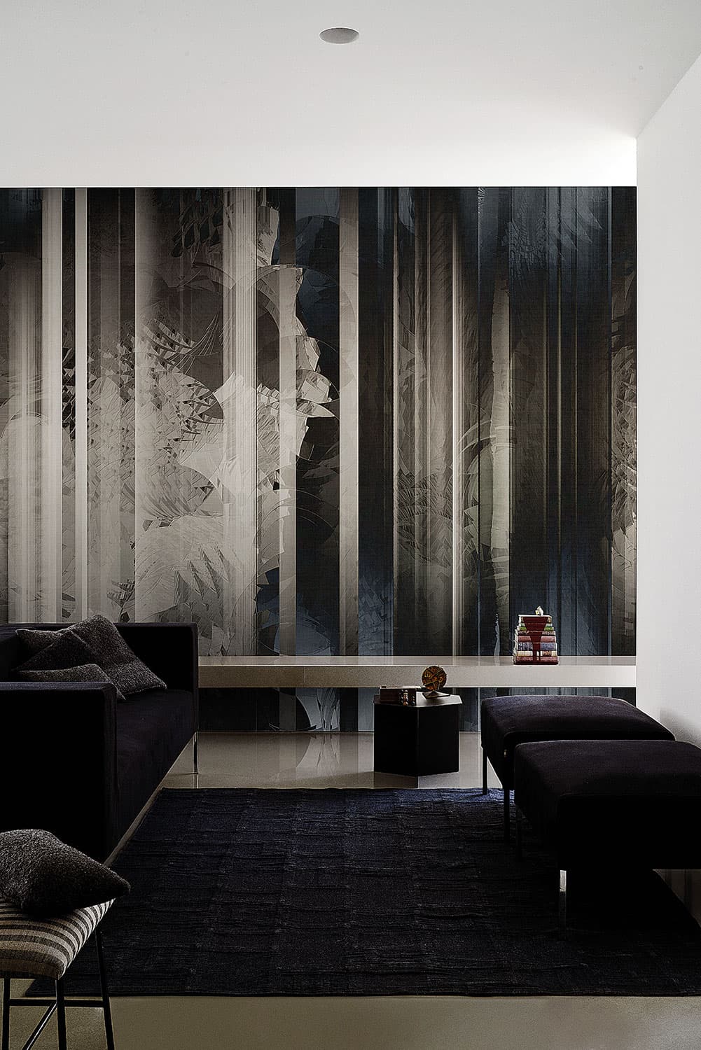 Maurizio LaiCode 19008 · 4 colourways
Blurred grey, pale and black bands of uneven width over faint foliage.
- flame
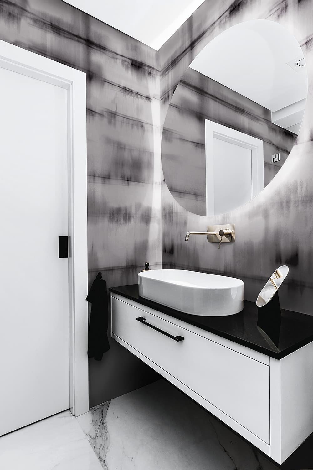 LondonArtCode 20507 · 3 colourways
Horizontal bands of blurred marks in greys and black.
- Moirage
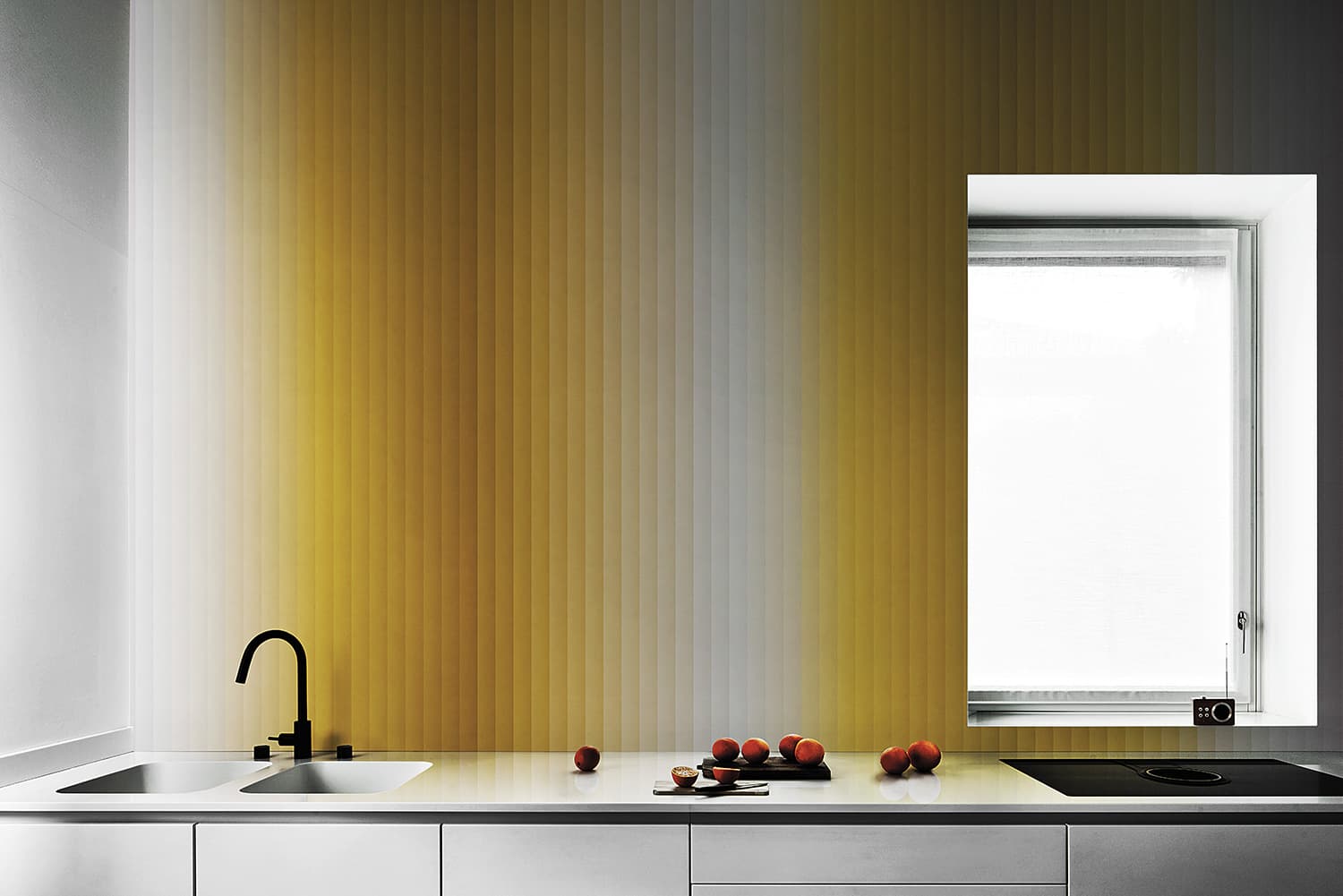 LondonArtCode 20518 · 4 colourways
Sharp-edged bands graded from one tone to the next, here ochre, white and grey.
- Nuanced Bands
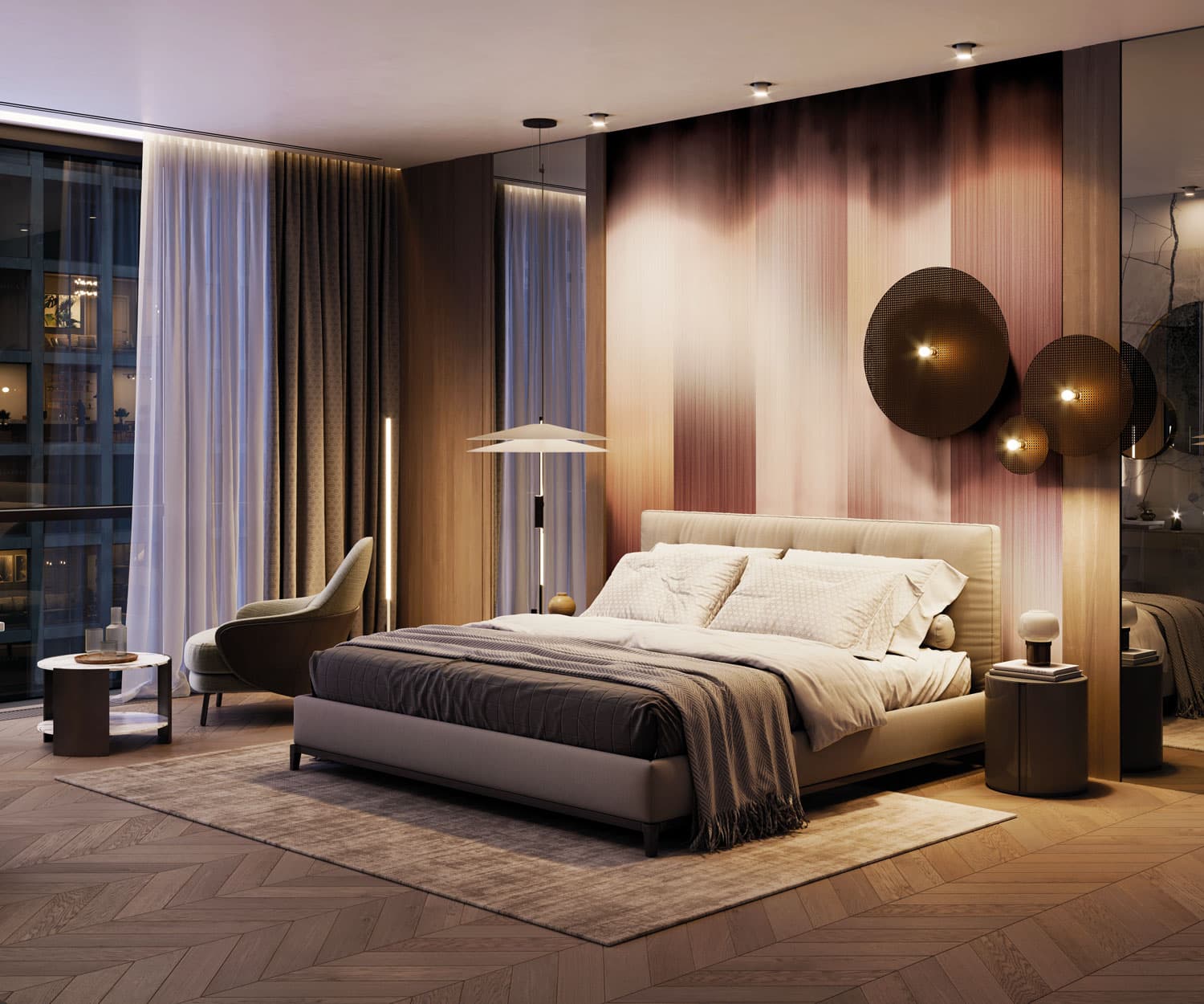 Fabio Fantolino · wall panelCode EWP1009 · 3 colourways
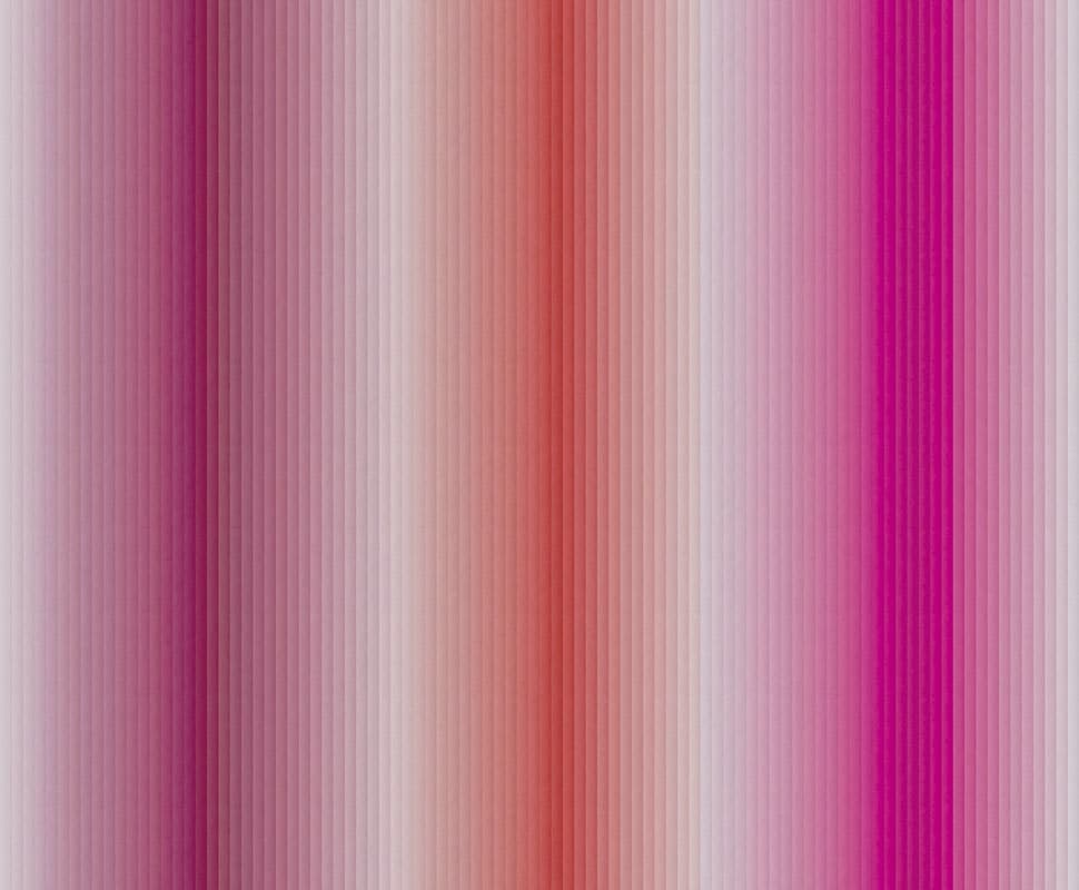
Broad, soft bands of pink, rose-brown and beige blending into one another.
Graphic stripes
In graphic stripes the lines build a larger figure: lenses, lozenges, waves and blocks set at different angles, or a face, a statue and big cats seen through bands of line and colour. Four come from Gio Pagani’s collection The Daydreamer, which LondonArt says “interprets wallpaper as a narrative experience”. Carlo Dal Bianco says that his Canova takes up a detail of the Neoclassical sculptor’s famous Hector.
- Twist & Shout
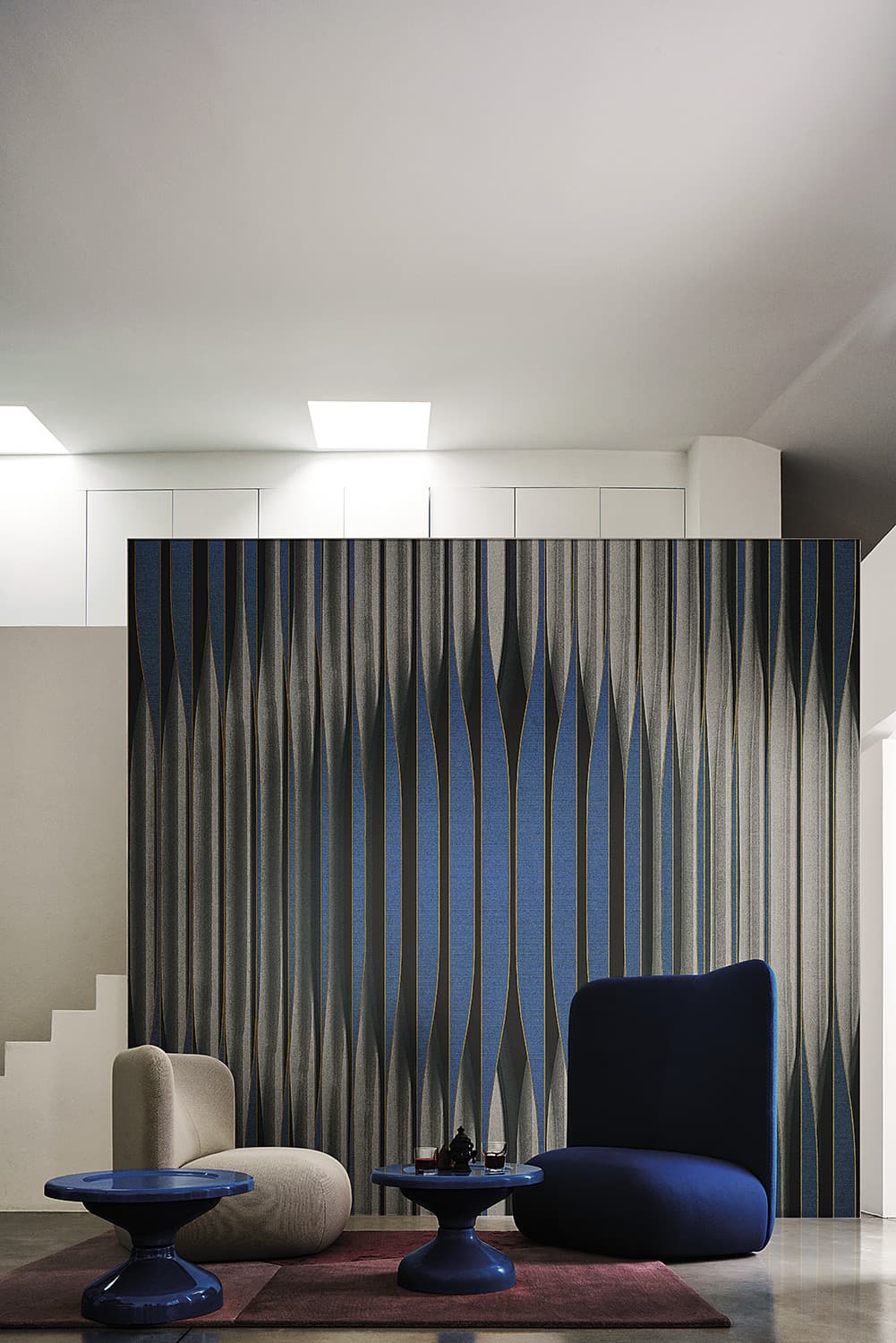 AquiliAlbergCode 20030 · 4 colourways
Fine vertical lines that swell and pinch into lens shapes.
- RUNNING GUN BLUES
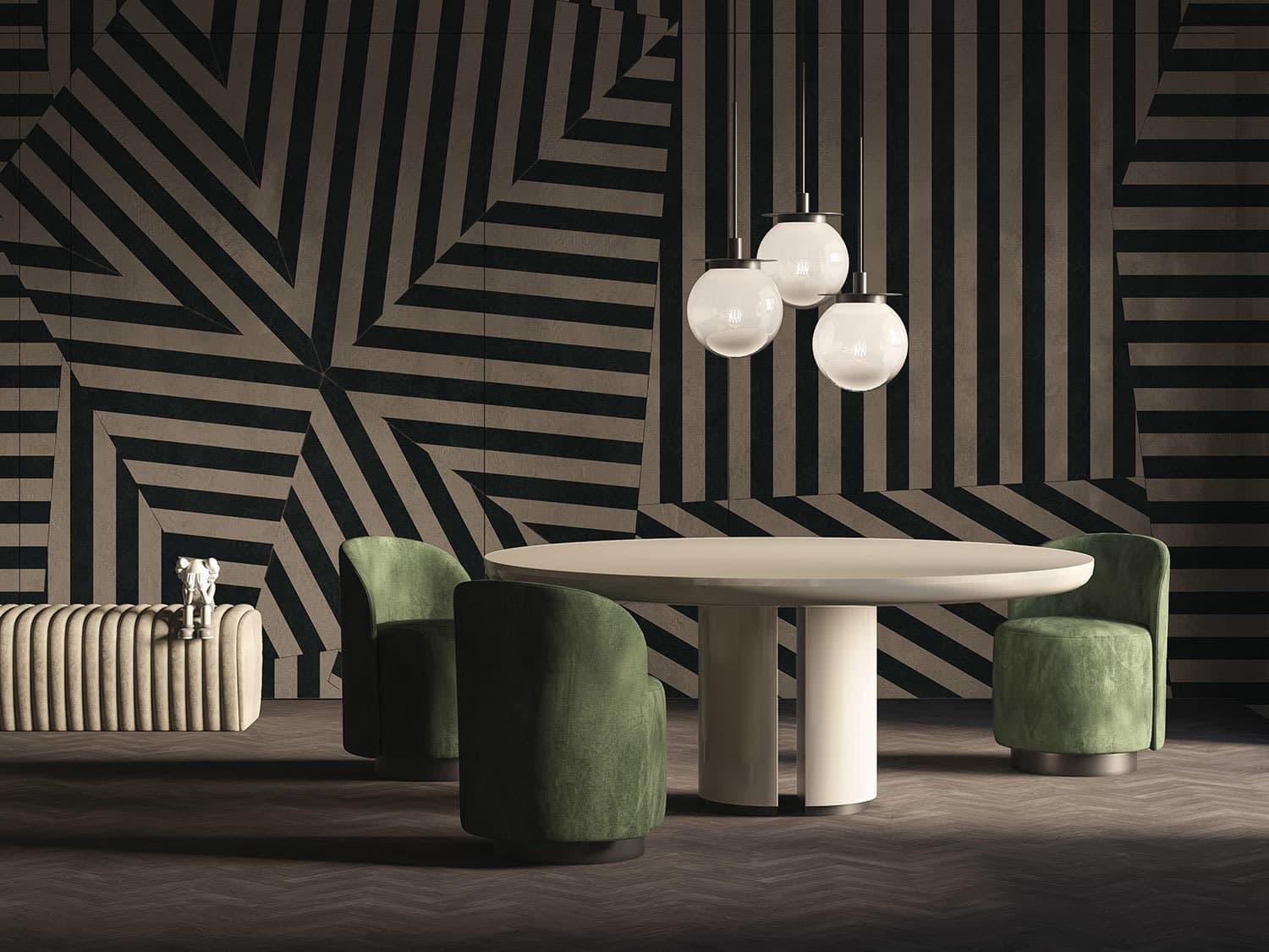 Gio PaganiCode T01S01 · 4 colourways
Black and cream stripes set in blocks at different angles: stripe on stripe within one design.
- Goodbye
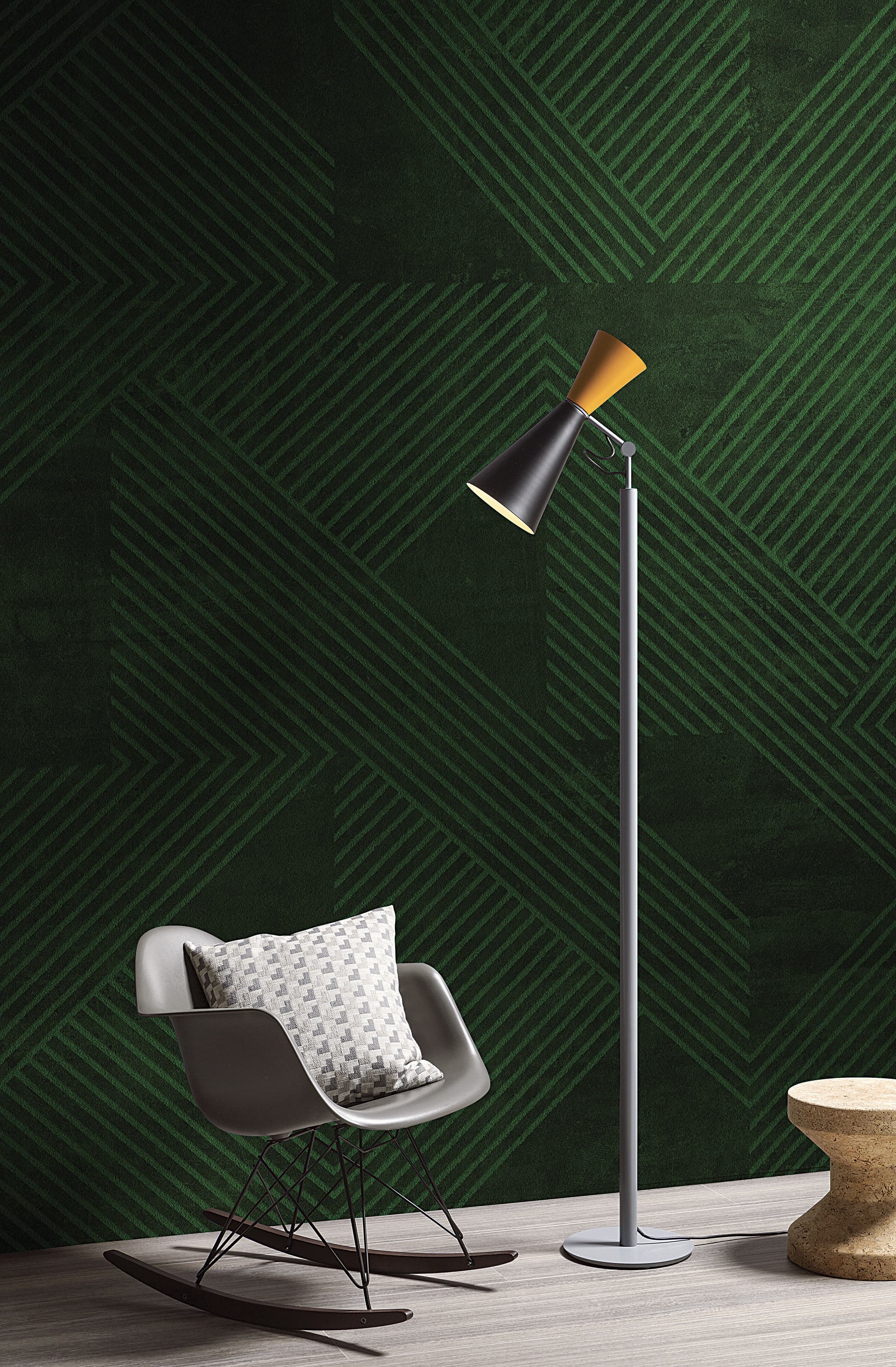 Carlo ColomboCode 18012
Groups of green lines in close tones, set diagonally in large blocks at different angles.
- Narben
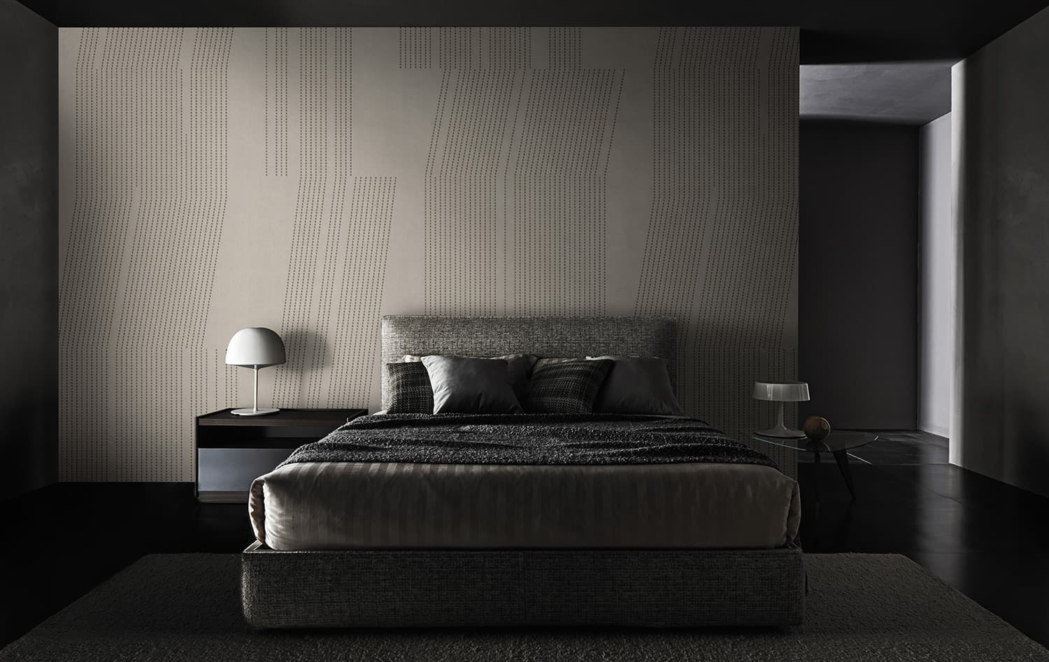 LondonArtCode 20055 · 4 colourways
Fine dotted vertical lines in groups, cut into blocks and shifted in steps.
- Lamborghini
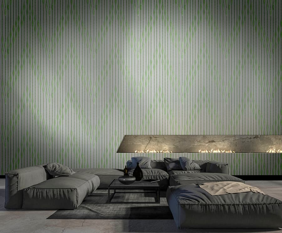 Zambaiti Parati · Automobili Lamborghini 2 · by the roll
Fine vertical lines that swell into long lozenges or bend into a large rippled diamond.
- CROSSROADS
 Gio PaganiCode TDV2GP302 · 6 colourways
Broad diagonal bands, here in black and white.
- MUSIC MUST CHANGE
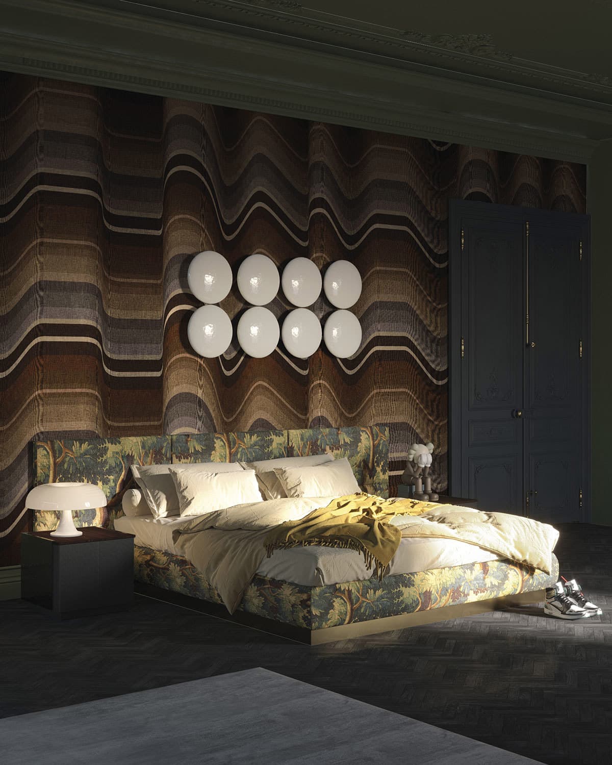 Gio PaganiCode T03S01 · 4 colourways
Horizontal bands in browns, grey and cream, rippling in regular waves.
- THE WIDTH OF A CIRCLE
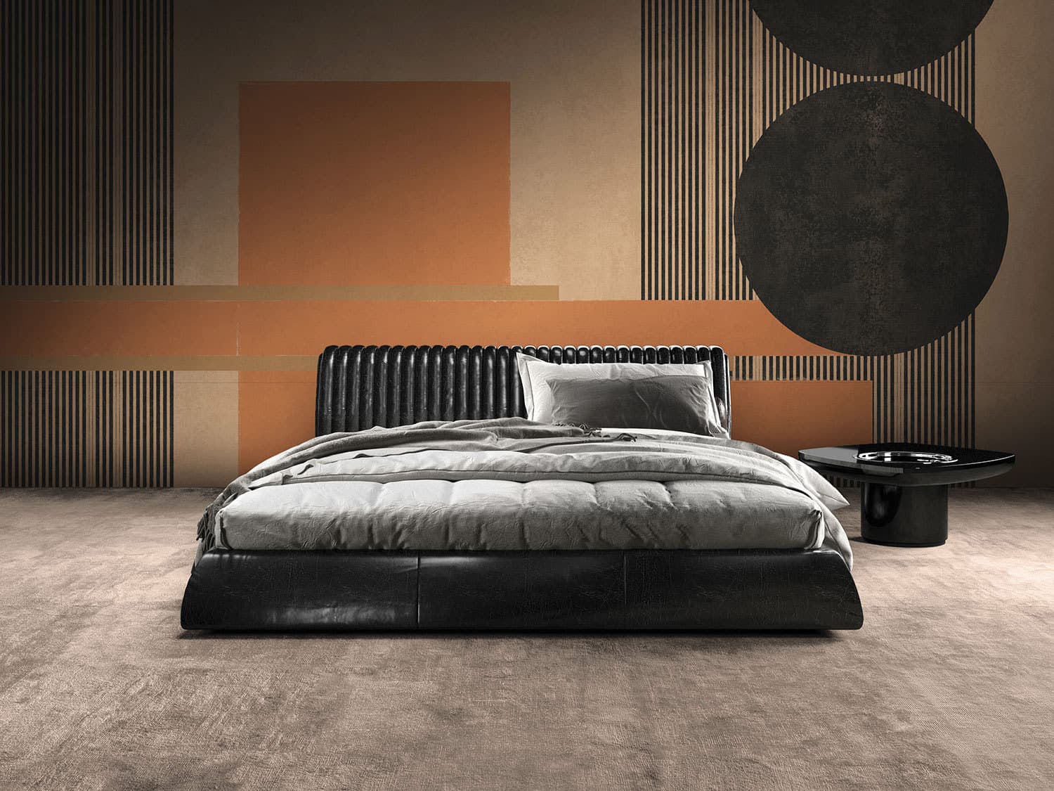 Gio PaganiCode T01S05 · 6 colourways
Orange bars and rectangles, two black discs and panels of fine vertical pinstripes on a peach ground, in the manner of the Bauhaus.
- Canova
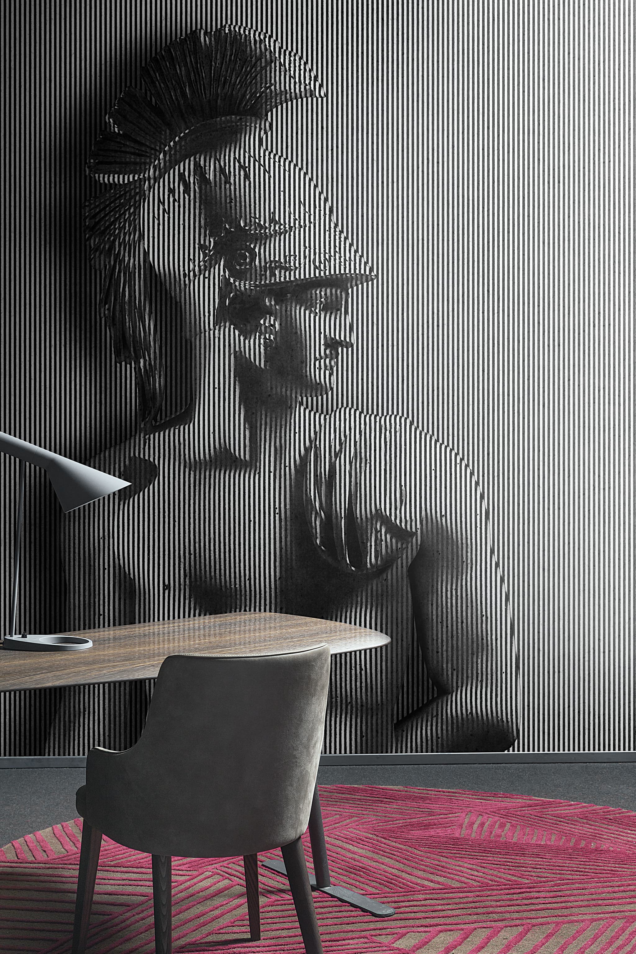 Carlo Dal BiancoCode 18052
A marble bust of a helmeted warrior, drawn in fine black-and-white vertical stripes.
- Dark Side
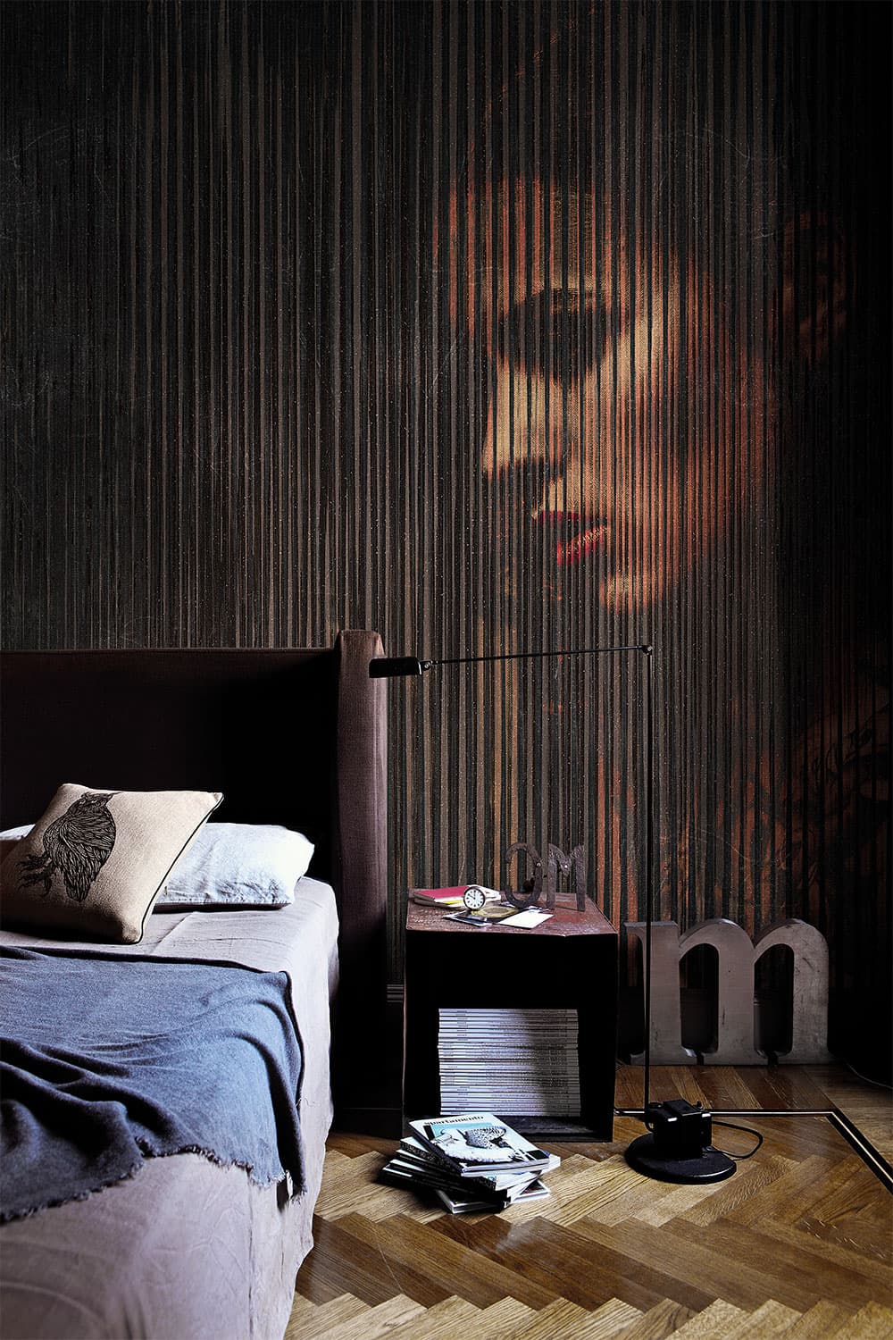 Valeria ZaltronCode 16063 · 4 colourways
A woman's face in profile, broken up by dense, irregular vertical lines over a dark ground.
- Sumatra
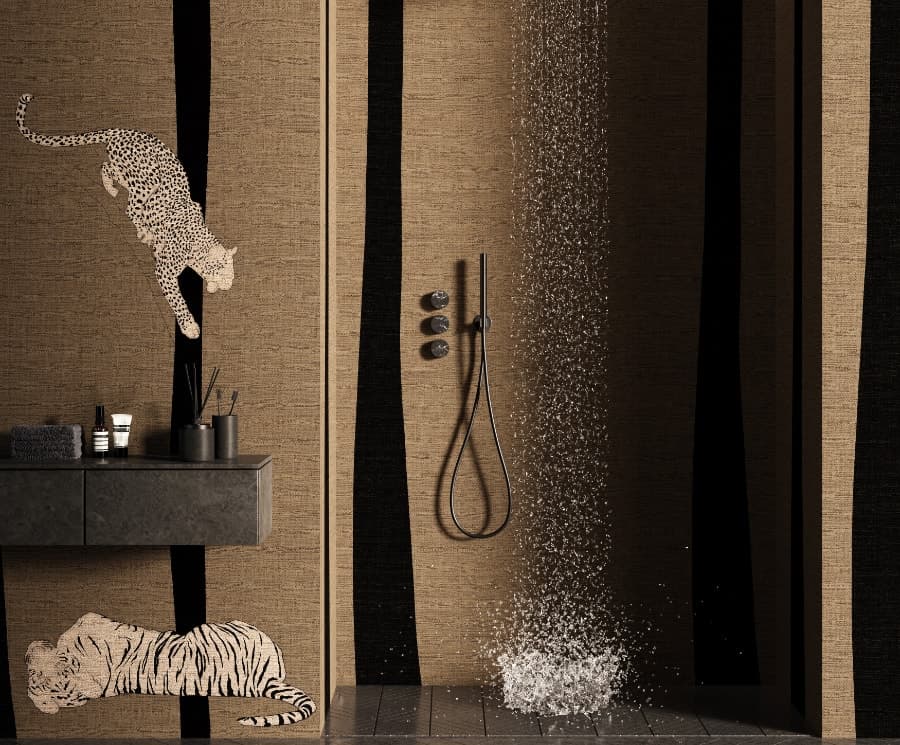 Zambaiti Parati · Project II · printed to fit the wallCode Z61001
Two leopards and a tiger on tall black bands, over a brown ground with the look of linen.
Blitz and Lungomare come from LondonArt’s Glass Collection, which LondonArt made for its GLASS material; with the Blue Glass Finish, GLASS is waterproof, for showers, basin splashbacks and external walls. Our guide to waterproof wallpaper explains it.
Florence and the tone-on-tone stripe
LondonArt’s Florence is a tone-on-tone stripe: vertical bands 13 centimetres wide in two close shades of one colour, on an embossed vinyl, meaning one pressed into relief, with a fine, cloth-like grain. Because its bands differ in tone rather than in colour, Florence is the subtle kind of stripe Marie Flanigan describes, drawing the eye up the wall, and it can serve as the plain beside patterned fabrics.
“A minimalist look. The Florence series is characterised by a delicate, clean and linear texture.”
Florence belongs to Unlimited, LondonArt’s range of textured wallcoverings sold by the standard roll rather than printed to the size of a wall. Its 18 colourways, each a colour version of the design, are coded FLO101 to FLO118 and run from whites and creams through sands, taupes and greys to blue-greys and a charcoal.
Florence is vinyl on a fabric backing, weighing 340 g/m² (grams per square metre), sold in rolls of 130 cm by 19.5 m (25 m²). Its pattern repeat is 0 cm, a free match, so the strips are hung without lining up a pattern. LondonArt gives its fire classifications as Euroclass B-s1,d0 under the European standard EN 13501-1, and Class A under ASTM E 84, the surface-burning test of ASTM International, the United States standards body; our guide to Unlimited explains both.
Florence has a sister texture with stripes: LondonArt describes Copenaghen as having “surprising detail in the form of soft, translucent stripes”.
If you like Florence, the nearest designs elsewhere in our range are Levriero’s tone-on-tone stripes and This is Always, and, a step quieter, the strié of Nuvia and Trussardi Casa 7. For Florence’s linear grain without its bands, see the fine vertical ribs of Lamborghini 3, Z12802 and Z12806.
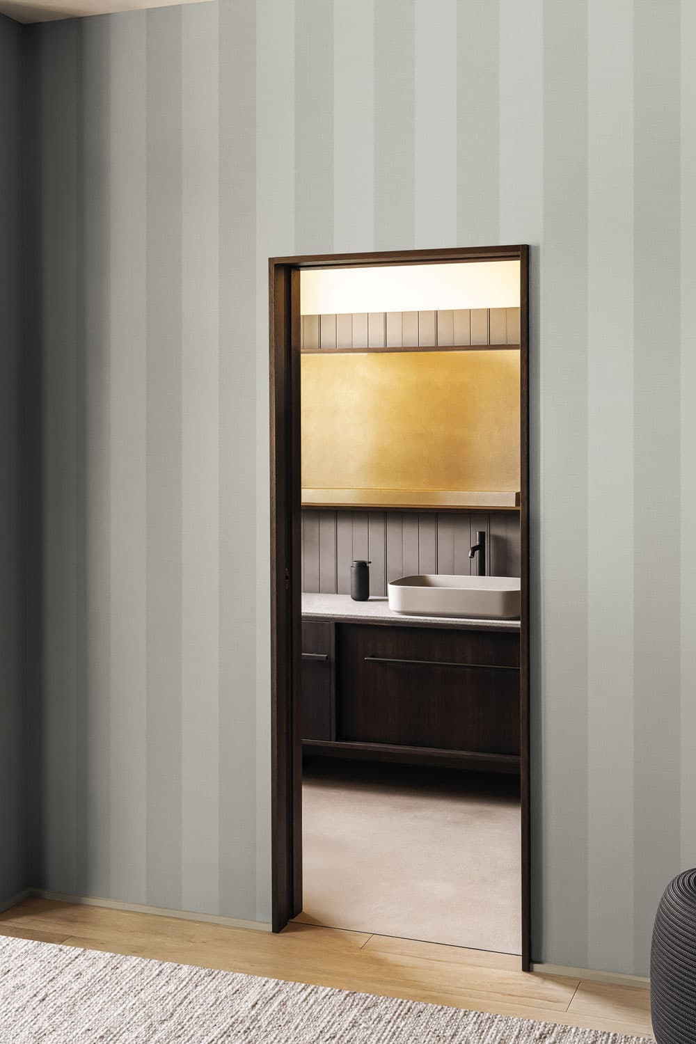
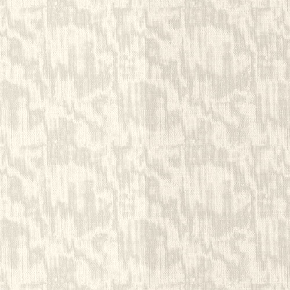
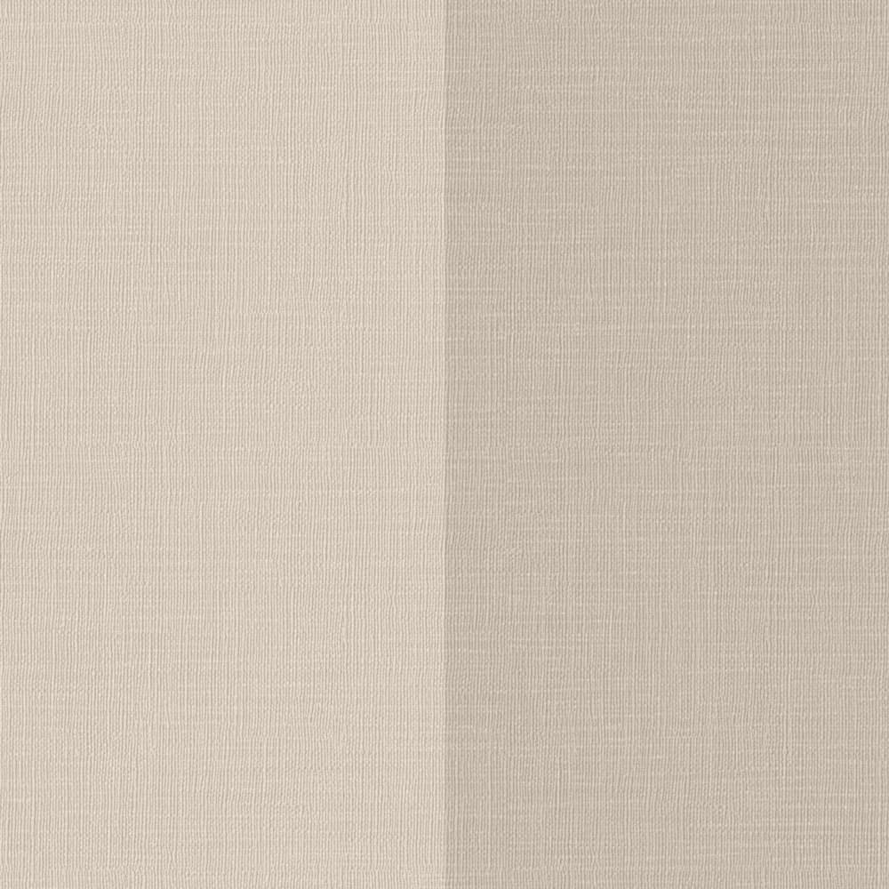
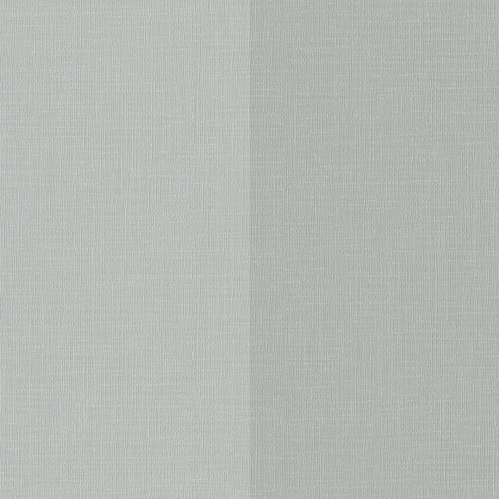
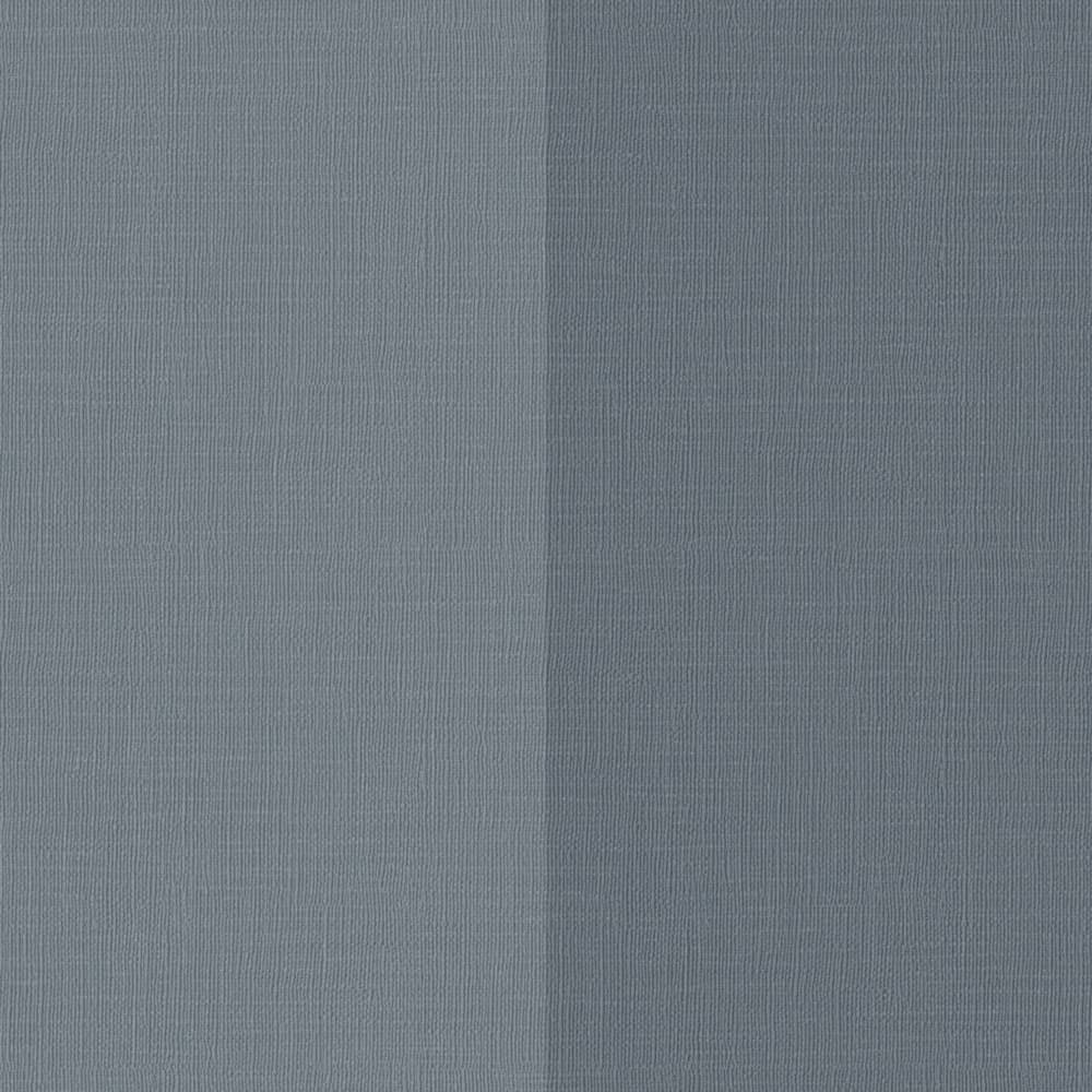
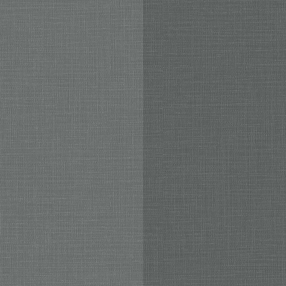
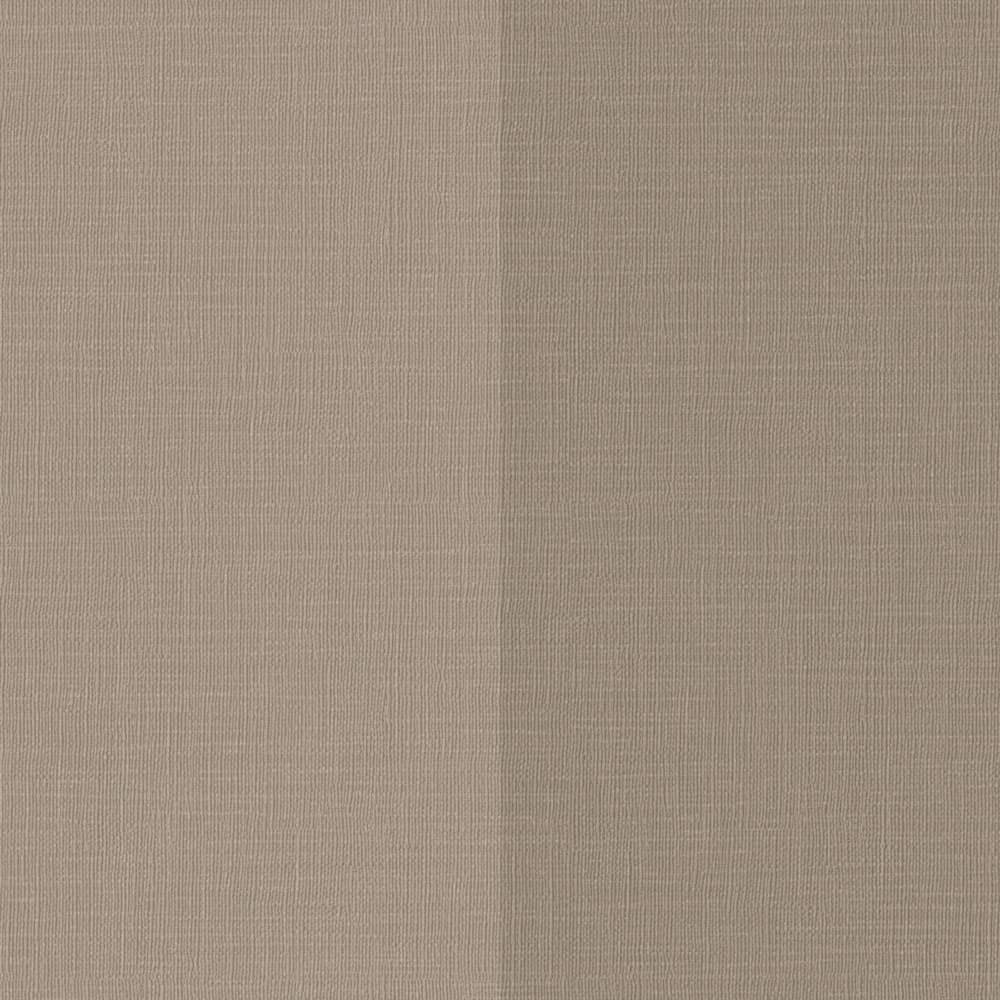
Six of Florence’s colourways, each shown as its two tones side by side. LondonArt cautions that “The images may not reflect the actual colours of the product.”
Bring a stripe into the project
A stripe is judged at full size, in the room’s own light. Ask us for a sample, try a design on your own wall, or browse the striped designs.
Samples are available on request, after a short conversation about the room, and our showroom at 106 Barkly Street, St Kilda, shows the murals at full scale. For a striped design in a shower or behind a basin, see our guide to waterproof wallpaper; for Florence’s material and fire classifications, our guide to Unlimited.